A/B testing is a must for a growing online business (all businesses really). It can help you find the best way to speak to your visitors and turn them into customers but knowing what to test can be tricky. In this post, we will go through the top nine A/B tests you can run to increase conversions.
1. Background design
Every site has a brand voice that helps them define themselves to their visitors, but finding what speaks to your visitors best can be difficult to find. Running an A/B test on different media options can truly impact your site’s conversion rate. Try testing between different images, whether it’s between two different product shots, lifestyle imagery vs. product photography or testing between different background colors or patterns. The possibilities for what to test are endless, but the results always provide insight. A client who used this tactic to its fullest was Roma Jewelry Design, who ran a test of a plain background vs. a lifestyle image. They found the more modern look had 37% more conversions.
2. Minimal change, big impact
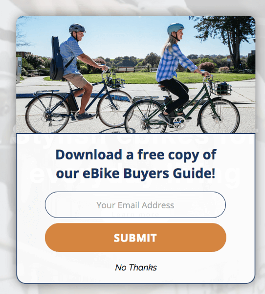
When running an A/B test, it doesn’t always have to be a huge change. Small differences can increase your performance as well, like button color, bolding fonts, adding graphic elements or changing font size. These simple changes can have an impact on your engagement and conversion rates! Take Blix Electric Bikes as an example, they ran a test on which color button worked best on their email capture pop-up. The A/B test showed that the orange button had a higher email submission rate, leading towards a more optimized site experience for Blix.
3. What you say
Another straightforward option is to test the copy you are using on the promotion. Trigger phrases like “Buy Now”, “Today Only”, or “One Time Offer” can be good to test out while trying to add urgency to your promotions. An example of this would be if you ran a test for the copy offering a free trial offer. Version A could say “Sign up for a free trial” and version B could say “Sign up for your free trial.” Comparing the substitution of “a” vs. “your” could show that one leads to more sign-ups than the other.
4. Utilizing tabs
Testing a tab on your promotion could prove to be vital to boosting conversions. A tab is a small box on your site that allows visitors to reopen promotions once they have already closed it. This tool can be invaluable, especially when A/B testing. Trying different colors, icons or copy can increase your engagement level as well.
5. What you do and where you do it
Where you present your promotion or how you present it can make a huge difference in the engagement rate. Testing a center vs. a full screen takeover or a banner vs. a center promotion can tell you which format your visitors respond to more. Leaner Creamer did a really great A/B test on this for their summer promotion.
They decided to run a test on their welcome offer for new visitors comparing a banner vs. a center promotion. At the end of the test, they found that visitors were 1761% more likely to engage with a center promotion and 1272% more likely to convert than with a banner.


6. Lead capture vs. messaging
If your goal is to collect as many emails as possible, testing a lead capture at different points during the user experience will help you find the best time to do it! Most sites have a lead capture for new visitors upon landing, but testing a lead capture on an exit offer or cart abandoner could increase your email collections.
7. Two step opt-in
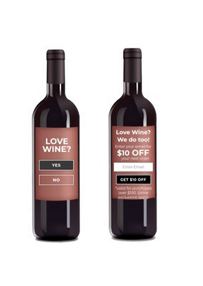
When utilizing a lead capture promotion, consider testing a micro-engagement with it. This can draw visitors in by having them engage with a simple question before entering their email. For example, IWA Wine tested this with the new visitor lead capture by adding a simple micro-engagement asking if visitors loved wine. Results show 60% of visitors were more likely to engage with the promotion if the micro-engagement was shown, leading to more emails collected. For more information about introduction screens and micro engagements, read this blog post.
8. Time incentivized offers
Another interesting thing to test is using the countdown timer to increase the urgency of your incentivized offers. This is best applied with messaging promos or flash sales. Giving your visitors a window of time in which to use an offer can increase your conversion rate because it instills a sense of urgency and the potential for “losing out” if they don’t purchase in time.
9. Switching up what you offer
When it comes to incentivizing your promotions sometimes it can be hard to be creative. Traditionally, dollar or percent off amounts have worked well, running a test like this allows you to see which of these discounts incentivizes customers the most.
If you are trying to restrict these kinds of discounts there are other options you can test. Giving away a free download, a gift card, or even an item from your store can prove effective when engaging with visitors. A great way to test this is in your cart abandoner offer as these visitors are at the bottom of the funnel and most likely to convert.
Final thoughts
Overall, A/B testing is a pillar of educated on-site marketing that can increase conversions, email collection, and engagement. Be sure that when running these tests, they are as similar as possible with small deliberate changes so when the results come in, you can take advantage of what you’ve learned.
There is no limit on what you can A/B test with Justuno. The more you test the more you know!