What Your Website Visitor Wants
Something they can use! (value)
Something refreshing (they’re hit with popups daily)
A cool visual
Something easy to understand (we’re visual creatures!)
Something that feels good (we’re human, too…)
What You Want
CONVERSIONS!
5 Rules for Email Popup Designs That Convert
1. Create straightforward headline
2. Shine a spotlight on your offer
3. Tell people exactly what to do
4. Make it quick (minimize fields)
5. Optimize for mobile
Headlines: What You See Is What You Get
“Join our Newsletter” just doesn’t cut it anymore. You need a headline that clearly states what value the subscriber will receive.
Tell them exactly what they’re gonna get!
Is it a discount? An e-book? A free product? If you don’t have an added incentive, let your visitors know why signing up is of value to them!
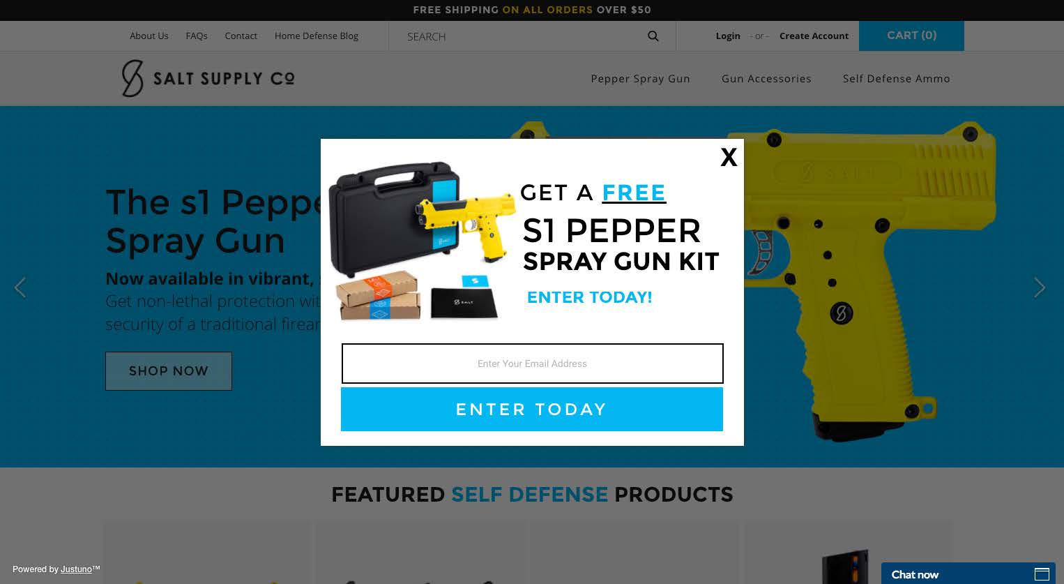
This example from Salt Supply Co. does a great job of getting the value add across to the visitor right off the bat. Even better, by contrasting the word “Free” with color and underline, the visitor’s attention is drawn to that word we all love to see..
Offers: Please Don’t Assume People Understand
One of the worst mistakes you can make is to assume the person viewing your popup knows exactly what you mean. Create an explanation of your offer that conveys to the reader any necessary details (without overwhelming them).
What is the minimum, necessary information they need to understand your offer? Write that in the text under your headline (the extension) so your user can gather the context they need to understand.
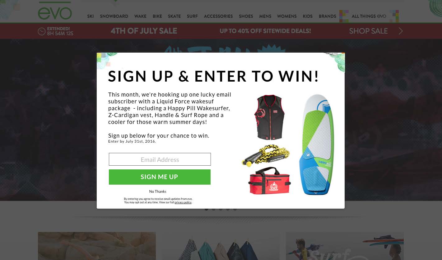
This example from Evo is great because they outline the timeline (“this month”), the exact items being given away, and even reiterate the contest end-date.
Being clear about your offer will save you headaches that come with vague language.
CTA (Call to Action): Tell Them What You Want Them To Do
When it comes to your call-to-action (CTA) button don’t be generic and please, do not use a CTA labeled “submit.”
Be clear, spur action, and show some personality if possible. Tell the user exactly what you want them to do.
BONUS: use some key words to provoke intrigue and inspire engatement (click-thru). Here are some effective words:
Get, Now, Quick, Close, Never, Over, Seconds, Rapidly, Fast, Hurry, Reveal, Instant, Again, Approaching
Form Fields: Make it Quick!
You have better chances of converting from your popup if it’s quick and easy. That means less form fields!
If you must ask for more information than an email address, don’t go over three fields. Anything over this and it appears to be too much work in the eyes of the visitor.
Pro tip: make sure the information you’re asking for is relevant to your marketing and the visitor. For example, if you’re selling shoes, ask for a shoe size so you can deliver more relevant marketing emails!
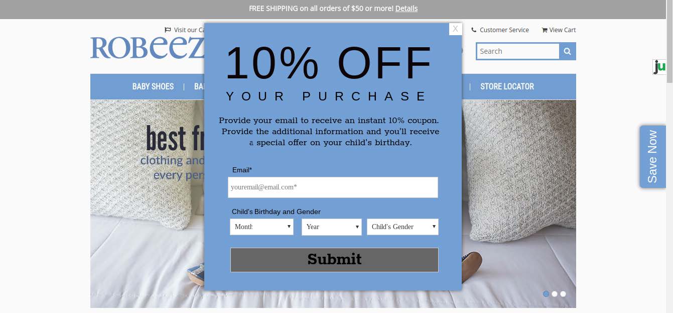
This example from one of our clients, Robeez, gets the birth date and gender of the child so that they can then send more targeted marketing emails to the subscriber in the future. For example, if the user enters a female baby with a birthday in February, they can send an email with sale items in February with a special discount for her birthday!
Mobile Popups: Yes, Google Allows Them!
Mobile traffic is different and therefore should be treated differently. This change the way you design and write copy for mobile pop ups.
A few things to consider: use less text, bigger font size, and blatantly showcase your offering.
Another thing to note, Google has recently updated their policies regarding mobile pop ups. In short, Google does not want you to present a pop up to visitors immediately after they click through from a Google mobile search result.
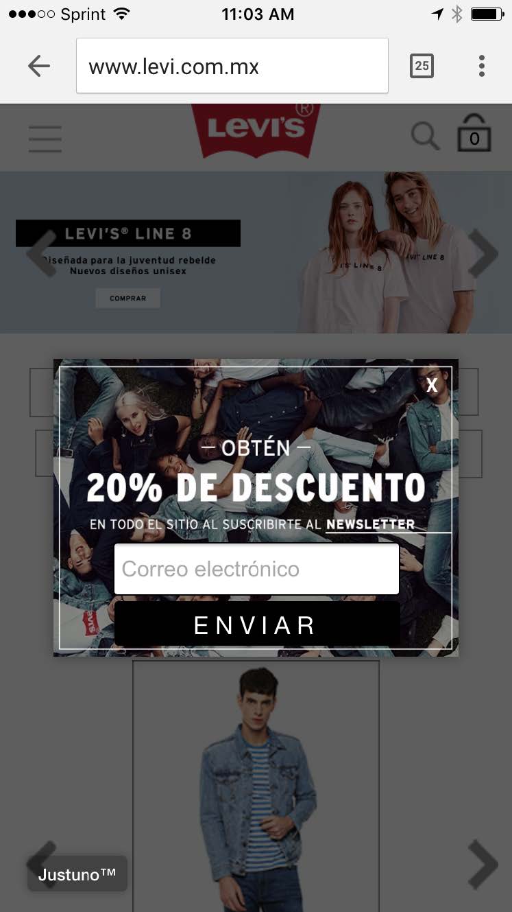
Here’s a great example from one of our clients, Levis Mexico, that appears to new users on mobile after they’ve been on the site for a short time.
Related Resources
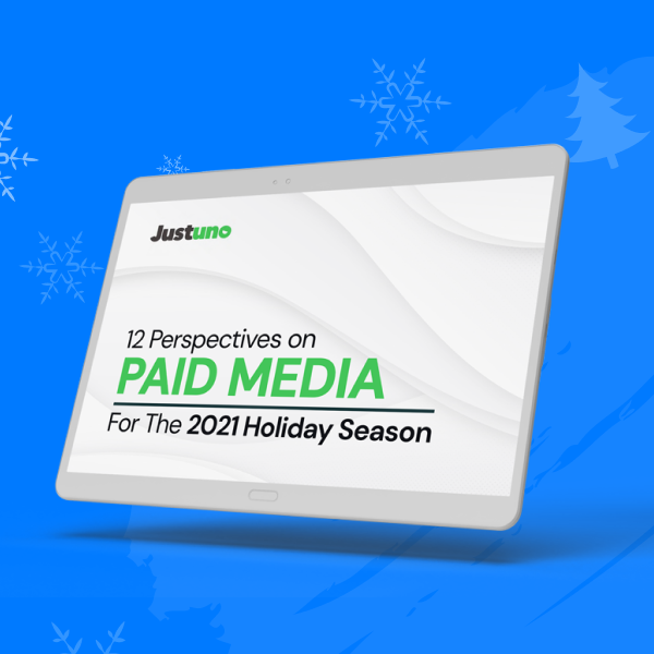
12 Perspectives on Paid Media for the 2021 Holiday Season
Get insights from 12 industry leaders on everything from pre-season prep, helpful automations, and more to make your return on ad spend skyrocket during the 2021 holiday season.

Onsite Conversion Optimization Benchmarks
Download our onsite conversion optimization benchmark guide to see how your pop-ups measure up to others.
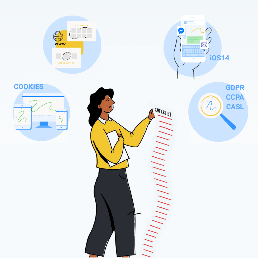
The Ultimate 2021 Privacy Compliance Checklist
Download the ultimate checklist for data privacy by Tinuiti for actionable steps to ensuring compliance in 2021.