One fundamental flaw whilst testing to optimize an e-commerce store is that testers are solely focused on their conversion rates.
That’s not to say that it’s not important. But what happens if your “losing” variation in a test actually brings in more revenue but has a lower conversion rate?
Did it lose?
Well, you’re in the business of making money. So unless you want more sales with less revenue, probably not.
It’s so important to look at all of the numbers when testing and follow what makes you the most money.
In this post, I’m going to discuss seven elements that can be tested to optimize e-commerce stores.
1. Category sorting
As a rule of thumb, you should be allowing your users to sort products on category pages.
This allows customers to display products in an order of their preference (Price, Alphabetically, Bestselling etc).
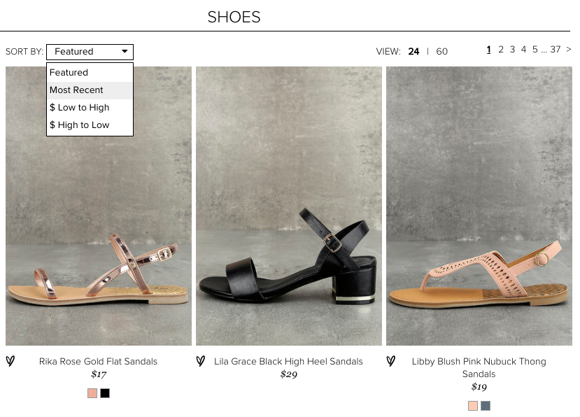
Potential category sorting options :
- Price (High to Low)
- Price (Low to High)
- Bestselling
- Newest Added
- Customer Rated
- Alphabetically (A – Z)
- Alphabetically (Z – A)
But what could be tested is how the products are ordered by default on the category page.
By displaying products in the order that drives the most sales, it will have the widest appeal.
One method to start with is by tracking which is the most frequently selected sorting order.
Using the results, this order can be implemented in an A/B test to measure its impact.
Other ideas to test include displaying bestselling products first, most expensive or maybe even products with the highest margin.
The aim is to find out is which sorting order makes the most money, not just have the highest conversion rate.
2. Product image sizes
Product images have a huge level of importance in any e-commerce store.
When buying a new pair of shoes, it’s very hard to go head over heels (excuse the pun) when the image is tiny.
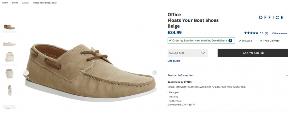
Office really shows off the visual appeal of their products.
But depending on what you are selling, the size of the image can have different results.
In a study by ConversionXL they found that search goods (i.e. laptop, printer, smartphone) had a higher perceived value with a larger image than with a smaller one.
But when it comes to experience goods (jacket, shirt, trainers), the study found that products had a lower perceived value with a larger image as opposed to a smaller one.
So from this research, it gives a basis for a hypothesis that can be tested to find out which image size works best.
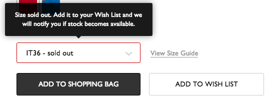
3. Out of stock messaging
So you find the product that you want in an online store…
You add it to your cart, start getting your credit card out and you’re prompted with the message :
“This item is out of stock”…
What next?
Well, you would probably leave to find the product on another website.
But what would you do if, in addition to the message, you were presented with a list of similar items?
You might hang around to see what they have to offer.
By ignoring handling out of stock items, you could be leaving money on the table.
In a study by GT Nexus, they found that “Approximately 60% of in-store shoppers and almost 70% of online shoppers became ‘lost sales’ when faced with a stock-out.”
So by assisting customers when an item is out of stock, we can try to lower the number of users that abandon the website.
To soften the blow of an item being out of stock and avoid the user leaving your website altogether, you should be making it as clear as possible early on in your sales funnel.
By testing ways to approach it, you’ll be less likely to leave the customer feeling frustrated after committing to buy it and finding out it’s unavailable.
This is how NET-A-PORTER handles their out of stock products.
It’s not only going to help with customer satisfaction, but it’s going to also hopefully take steps to make them a customer rather than pushing them towards a competitor.
Here are some ideas of how out stock messaging can be addressed :
- Suggest similar items
- Notify the customer when it is back in stock
- Estimated in stock date
- Allow ordering with a delayed shipping date
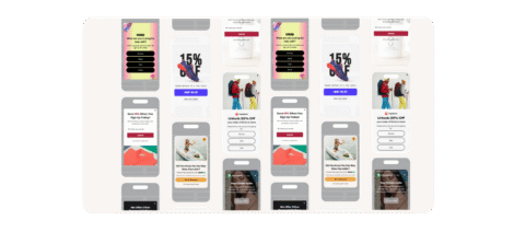
4. Checkout process
Conversion Rate Optimization isn’t just about testing little things like colors and headlines.
It’s about testing the big things too, like the checkout process!
Your checkout process includes the steps that a user takes from adding to cart to completing the purchase.
The checkout is big business. In a case study by eConsultancy , it discusses how ASOS implemented a guest checkout option and were able to lower cart abandonment by 50%.
So testing the checkout can certainly have a big impact.
The usual steps for a checkout are :
- Shopping Cart
- Enter Contact Details
- Enter Payment Details
- Checkout Complete
But how it is implemented is a prime candidate for testing.
Usually, checkouts will fall into one of two processes. A single page or multi-step checkout.
Single page checkout is when all of the required information is presented on one single page (Name, Address, Telephone, Email, Payment Details etc).
Multi-step checkout is when the required fields are broken down into individual steps.
Some customers may be daunted by having to complete one large form. Others may like to see everything they need to complete all on one page rather than going through multiple steps.
If it isn’t tested there is no way of knowing which method customers prefer and makes the most money.
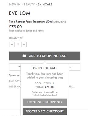
5. Add to cart
So when your customers add the product to the cart, what happens next?
Do you keep them on the product page with a notification? Or do you redirect them to the cart?
By keeping them on the product page, in theory, you’re allowing them to continue shopping. But by taking them to the cart, you’re moving them into the checkout towards the conversion goal.
Which one works better? As I’ve mentioned throughout the post, each business is different and what works for one company may not work for yours. That’s why testing is pivotal in finding out what works best on a website.
Harvey Nichols has decided to keep the user on the page but they present the user with the option to either continue shopping or go to the checkout.
Optimization tests results should compare the average order value as well as the conversion rate to see which variation makes the most money.
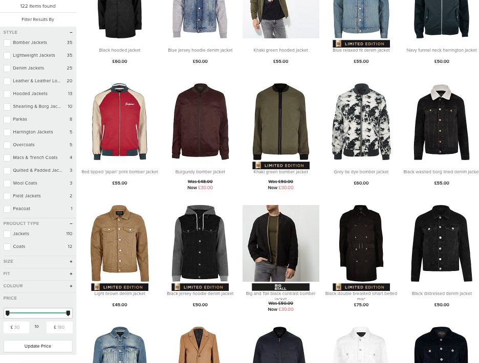
6. Filters
Filters are your way of letting your customers find the right product for them.
Let’s say you have 10 pages of 50 products for a particular category. It’s going to take a fair commitment from your user to work their way through all of them. Or if a shopper searches a common product type on your website, filters will help optimize the search results.
Filters let your customer find products that meet their requirements.
And it can have a dramatic impact too. In an article by Econsultancy, they discuss how buyakilt.com saw a 26% lift in conversions and 76.1% increase in revenue after implementing a product filter.
River Island do it particularly well, keeping it clean and easy to use with a count of products in each category :
What can you test?
This is where you can get the creative juices going.
You know your customer better than anyone, so you should know the main factors involved when they are considering making a purchase decision.
Prioritize what is most important to YOUR users when deciding on what to include in the filter menu. Additionally, order the hierarchy based on the prioritization.
Users may be motivated by Price, Color, Shape, Size etc. It will all be dependent on the type of product you are selling and your customers.
Optimization Tip : If you don’t know which order to prioritize the filter options, start tracking which ones are used the most and run a test based on the findings.
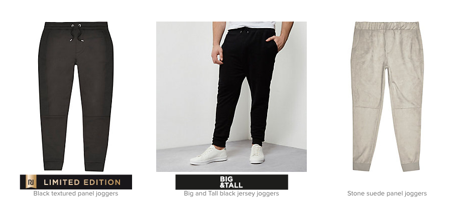
7. Product badges
Product badges help you promote particular products on your category pages.
You may want to promote products that have the highest margin or a feature you feel would be important to your customer.
Here is an example of product badges in action from River Island :
Examples of Product Badges:
- Bestsellers
- Offers Of The Week
- Best Reviews
- Free Delivery (When delivery is not usually free)
- Just Arrived
- Discounts
These also need to be used sparingly and not on every single product. If you bombard the user with too many, they’ll lose their impact.
By testing which one works better, you will also be able to gain valuable customer insights.
Finding out if a customer resonates with a product being the best seller or maybe finding your customers are early adopters to new products can help provide insights for all areas of your optimization and marketing.
Thanks for taking the time to read this post on e-commerce site testing. We’d love to hear any insights based on recent tests that you’ve run on your own store!
Happy Optimizing!