By 2021, more than half of e-commerce sales are expected to be made through mobile devices. Yes, small-screen shopping will soon overtake desktop purchasing, meaning it’s never been more important to provide a slick mobile e-commerce experience for your customers. Fail to provide a seamless mobile user experience (UX), and you could be leaving serious money on the table.
Not sure where to start? Here are seven simple strategies you can use to craft a five-star mobile UX for your e-commerce customers.
#1 Understand Who Your Users Are
First up, you need to understand your users inside and out. Knowing who your customers are is imperative to creating a great mobile UX. Before you jump into designing your mobile site, get to know your customers’ shopping behaviors, what pain points they may have, and what their ultimate goal is.
It’s not enough to rest on your assumptions, though. Instead, you need to delve deep into the minds of your website visitors and gather evidence to support your understanding.
There are plenty of ways to collect UX feedback from your customers, including incentive-led surveys, social media polls, focus groups and discussion forums. Gather both positives and negatives about their experience so you can identify what’s working and what’s not.
You can transform these newfound insights into real results for your e-commerce business!
#2 Optimize Your Mobile Website For Speed
A must-have when it comes to mobile UX for your ecommerce store is speed. Just a three-second delay in load time will turn more than half your mobile visitors away, costing you significant amounts of money in lost sales, not to mention leaving a dent in your brand’s reputation.
Here are some top tips when it comes to ditching the digital weight and increasing your mobile loading speeds:
- First off, use speed analyzing tools to point you in the right direction. Testing tools such as SpeedTest.net and Google’s Page Speed Insights will help you isolate any issues.
- Leave behind any unnecessary code and keep detailed plugins to a minimum.
- Try to avoid heavy media files. For faster loading times, stick to one optimized hero image rather than slideshow banners.
- Optimize your images.
- Experiment with lazy loading (this delays the loading of non-critical resources, like images, until they are needed).
Lightning-quick mobile pages translates to a better customer experience with more satisfied shoppers, which in-turn lowers bounce rate, increases conversions and boosts your bottom line. It could also see your site climb the rankings with improved SEO!
#3 Simplify Your Mobile Navigation
A clunky and cluttered navigation will send shoppers running for your competitors’ hills in an instant. Today’s consumers are looking for effortless mobile interactions, so keep your mobile navigation condensed, consistent and accessible.
When designing your mobile site navigation, ask yourself (and your users), what are your most important pages? What are the most common actions taken by mobile users? Are there any elements featured on desktop that can be dropped for your mobile site? Having clear answers to these questions will help you decide which items to include in your navigation.
For a clutter-free mobile UX, the hamburger menu is where it’s at. Tucking everything away neatly, it stops users being overloaded with choices and battling with the dreaded decision fatigue. It also allows for direct navigational access, meaning shoppers can click straight through to the page of their choice, which is great for usability and speed.
Navigating your mobile e-commerce site should not be hard work. Use clear and simple language, written in a way that lets users know exactly what to expect (and in a font that’s large enough to read without zooming in!). Create an intuitive navigation that limits thinking, scrolling and clicking.
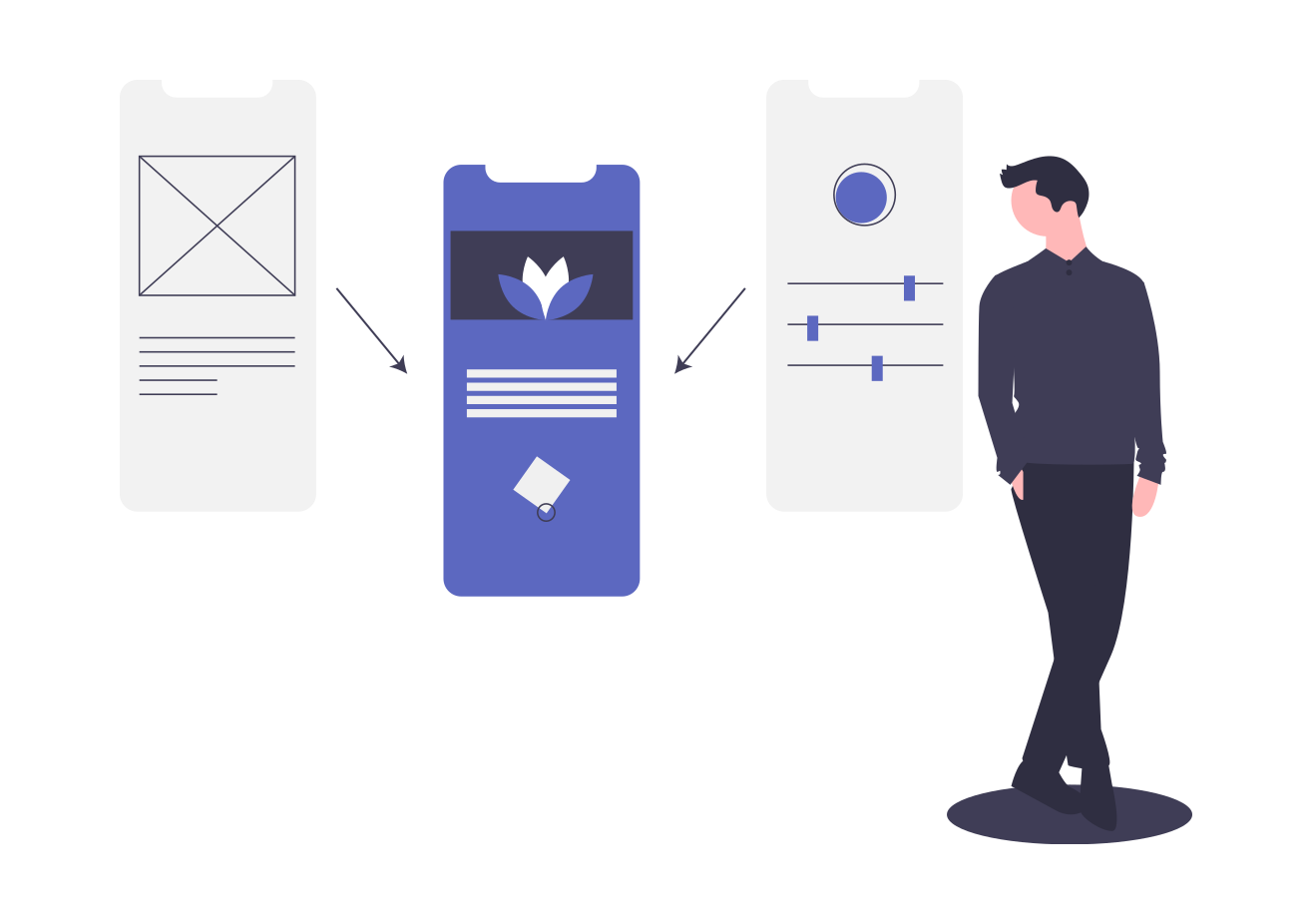
Consider serving up an image-based navigation menu for a super-smooth mobile UX. This will maximise usability, helping users to make quicker navigational decisions and find desired products more easily.
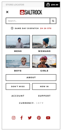
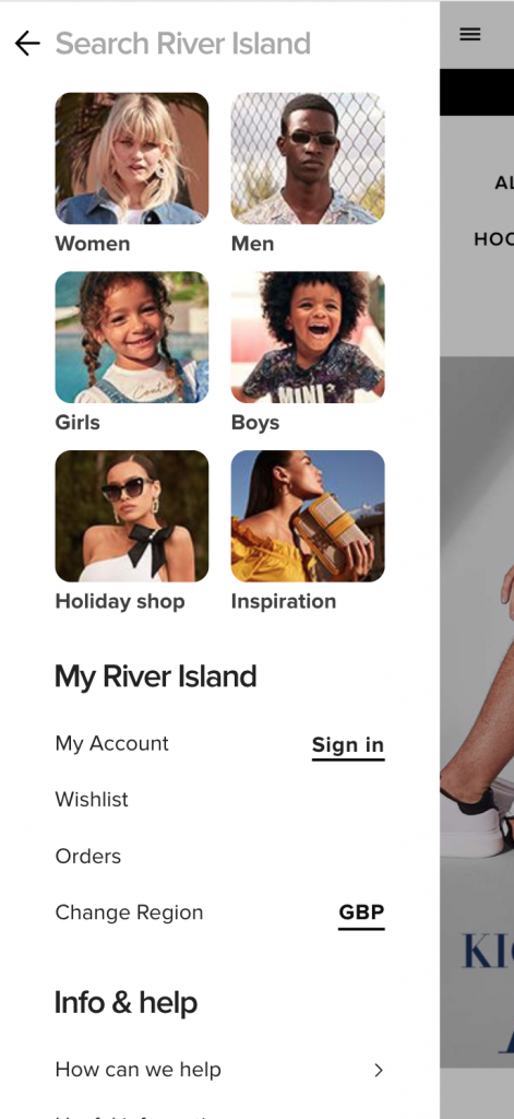
For leading surf fashion brand Saltrock, their conversion rate was lifted by 12% after their list-based mobile navigation was replaced with an image-based button menu in an A/B test!
Other fashion retailers like ASOS and River Island also make use of image-based navigation to improve mobile UX:
#4 Calls To Action: Go Bold Or Go Home
When it comes to ecommerce design, persuading visitors to convert is the aim of the game. One way you can guide users along the path to purchase is with clear, compelling, clickable calls to action (CTAs). Let’s take a look at some best practices for creating mobile CTAs that convert.
Present your CTAs as clickable, thumb-friendly buttons that stand out from other elements on the page. Use bold colors that contrast with other colors on the screen to grab the attention of your user (whilst being careful not to stray from your brand guidelines with random neon shades!).
When it comes to wording, keep copy short, positive and to-the-point. Use active commands such as ‘Buy Now’ and ‘Add to Cart’ to communicate urgency and inspire action from your customers.
Use of consistent CTAs across your mobile site will help users become familiar with buttons and ultimately guide them quickly through their purchasing journey.
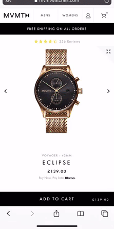
Look to implement a fixed CTA button on your mobile product pages. This gives the user the opportunity to complete a purchase at any time. As they scroll and discover more about the product, they can easily add the product to their cart once with a quick tap.
#5 Simplify Mobile Form Interactions
Have you ever been shopping on your smartphone and quickly abandoned your cart after being faced with a long and complex form to complete? Chances are, yes. This is one of the biggest mistakes when it comes to mobile e-commerce UX after all, and something that well and truly turns off today’s time-poor consumers.
So how can you go about creating a friction-less mobile form? Here a few simple tactics:
- Give your customers the convenience they crave with simple, stripped-back forms limited to just the most essential fields.
- Place form fields within comfortable thumb-reach.
- Remove any unnecessary space between form fields, as this requires conscious decision-making for the user to scroll and increases the risk of them jumping ship before checking out.
#6 Don’t Forget The Footer
Often overlooked on mobile e-commerce sites, the footer has an important role to play in a customer’s experience. It may not be the most glamorous or exciting element of your page, but, done right, it serves as a valuable navigational tool and provides links to important information such as shipping rates and returns policies. This type of information can have a direct impact on buying decisions, so a smooth UX is key!
Your footer should be easily discoverable, predictable and consistent. Don’t make the mistake of trying to hide or collapse the entire footer – shoppers expect it to be there and will often use it as a point of reference.
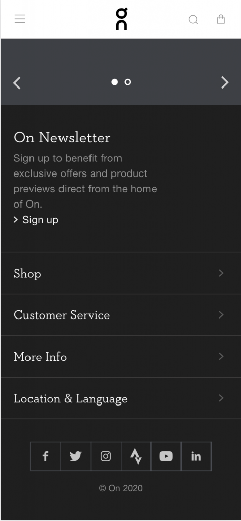
Prioritize footer content and use clear, conventional link names to aid navigation. Try splitting your footer navigation into distinct semantic sections. This will reduce cognitive load and make it easy for users to locate exactly what they’re looking for with a quick scan of the footer. You could also experiment with nesting footer links in collapsed sections in order to save space, like Swiss running shoe and apparel retailer On:
#7 Test And Iterate
For optimal mobile UX, always look to learn and improve as your consumers, trends, and climate change. You need to be monitoring, measuring, and making improvements over time, carrying out regular tests, and continuously engaging in feedback cycles with your customers.
Don’t make your UX decisions based on gut feelings – instead, you need to iterate based on real user behavior. Whenever you’re making changes to your mobile e-commerce site, run A/B tests to determine their impact on your given conversion goal.
Final Takeaway
With mobile e-commerce on a rapid upwards trajectory, you can’t afford to scrimp on the UX of your mobile site. Use these seven simple strategies to help deliver a smooth mobile shopping experience for your customers and start generating more sales from the small screen!