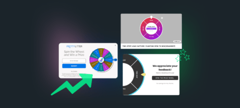
Call-to-actions, or CTAs, are everywhere you look in marketing from emails, onsite messaging, SMS marketing, and more. That’s because the goal of any marketing campaign is to get a visitor to do something, and every step along the way is usually the result of a CTA click.
Email lead capture? It’s a CTA click
Add to cart? CTA click
Purchase? The ultimate CTA click.
A CTA is supposed to be the most compelling element of your content, but the perfect one can be elusive. That’s why we went to the experts! We surveyed several of our top agency partners for some stellar CTA examples to inspire you.
CTA FAQs
A call-to-action or CTA is an element designed to create a response or encourage a certain action, the exact wording and goal of each CTA will depend on its context within your marketing.
A CTA can be anything from “Claim your offer” to “Sign up now” or more creative copy. It’s all about what you’re trying to get the visitor to do—how you phrase it is up to you.
The answer depends on your audience, so A/B test to find what is YOUR best CTA. But in general, the most effective CTAs spotlight the value someone will receive and incentivize them to do the action through urgency, FOMO, etc.
Fostr
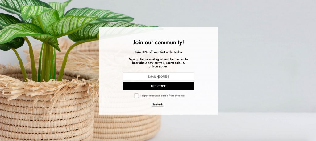
Welcome Offer
Here’s a welcome offer from our agency partner, Fostr, for their client, Bohemia. They’re using the “Get Code” button as the email submission AKA call-to-action. This text serves as a subtle reminder that if the user enters their email address, they’ll be rewarded with a discount code. The idea that the visitor is getting something (the code) rather than giving up something (their email) encourages conversion.
For the close button, the copy “No thanks” implies that users have to actually turn the discount down. The idea that they are saying they don’t want it is meant to make users think twice before closing the promotion.
Full-Screen Pop-Up
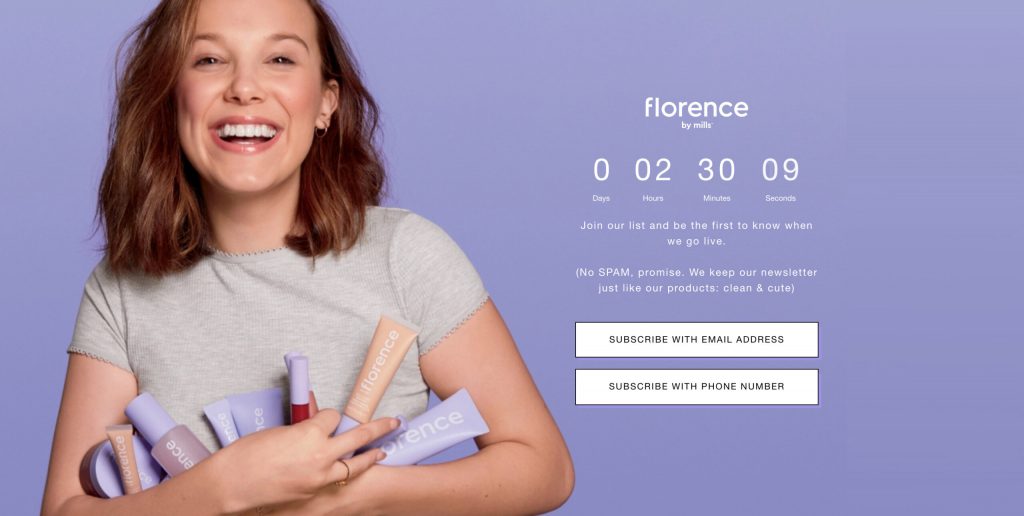
For their beauty client, Florence by Mills, Fostr created a full-screen takeover promotion that functioned as a landing page to collect pre-launch data.
They used two CTAs in one promotion, allowing the visitor to select their preferred method of communication. Each CTA opened a new screen with either an email or SMS field, depending on which option was clicked.
This strategy is based on the fact a user is more likely to engage and remain a subscriber if there is an option to choose their preferred method of contact.
Both of these examples by Fostr show a clear understanding of their target audiences and what appeals to them. The first focuses on a psychological aversion to turning something down and a fear of missing out on the deal. The second focuses on self-selection, by letting visitors pick their preferred channel you instantly improve the relevancy and impact of your marketing.
Visiture
Email Lead Catpure
For this brand, Visiture, used a strategy of alternative call-to-action copy as an opportunity to highlight a playful tone and reinforce overall branding. They kept active language but avoided using a standard “Shop Now” message.
CTAs are a great opportunity for showcasing your brand personality and entertaining your target audience. Depending on the tone of your brand voice, you can play around with alternative copy on CTAs but the success here relies on maintaining a strong brand tone and a keen understanding of what resonates with your target audience. Be consistent, but have some fun with it!
A few of our favorites that we’ve seen our clients use:
- My inbox is lonely
- Let’s go shopping
- Come fly with us
- I’m on the list
Email CTA
In this example, Visiture, added animation to catch a subscriber’s eye, while also using reinforcing copy to draw attention back to the main value proposition of the email. The goal of this email is to drive the subscriber back to their website and at the same time educate them about what makes Park Seed’s product great.
Emails aren’t limited to just one CTA, either. There can be several within a single email depending on the purpose of the campaign and where you’re trying to drive traffic.
For abandoned cart email flows, it would make sense to have one large CTA directing the subscriber back to either a cart or checkout page. For win-back campaigns, there may be several CTAs, trying to entice a click-through to several new products or collections. If you’re looking to clean up your email database, you may send an email asking if they want to continue being a subscriber, offering two CTAs: one to opt out and one to change their email preferences.
These are just a few examples of how CTAs can be used in emails at various stages of the marketing funnel. Every time a subscriber clicks on a CTA, you’re learning more about their interests and can use that first-party data to inform future campaigns (even if that click is an unsubscribe!).
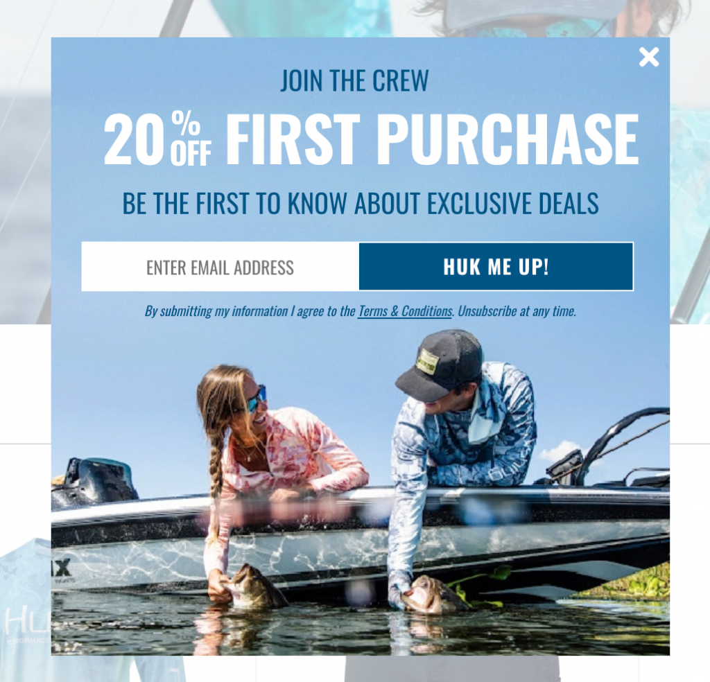
Eventige
Exit Offer
Here, Eventige is using an exit offer to encourage visitors to stay on their client’s website, PBH Food, a little longer. This animated pop-up is not only effective in capturing the user’s attention but also presents them with an offer that has no strings attached.
This makes users more responsive to accepting it as they aren’t exchanging any information. An additional benefit to this no-strings-attached strategy is that it hinges on the theory of reciprocity, where giving consumers something for free tends to create a sense of obligation and increases conversions.
Email Lead Capture
This next example from their client, Black Buffalo, is an animated subscription pop-up whose effectiveness is two-fold. One, it is visually interesting with a prominent and provoking headline. And two, it only requires two essential pieces of information, easily guiding a visitor through the signup process. While the CTA here is a standard “Subscribe” button, it works well with the compelling visual aspects and ease of use.
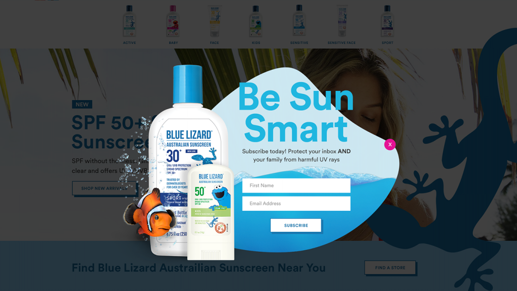
Exit Offer
Another email pop up by Eventige, for Blue Lizard Sunscreen, uses familiarity to capture visitor attention. Specifically by positioning a well-known Sesame Street character inside the pop-up, leveraging a marketing partnership to generate increased trust. The CTA copy reads “Subscribe” but that works well with the initial feeling of familiarity from the featured character, leaving that as the promotion’s featured element.
In another example of efficient sign-up processes, this only asks for two pieces of information making it quick and easy. The fewer barriers to opt-in the better, while that may feel like you’re sacrificing potential data points, you can always ask for more information later or even better, leverage hidden fields in your promotions to maximize each opt-in.
What To Keep In Mind About CTAs
Whether your marketing is looking to drive newsletter sign-ups, free trials, or get customers to add something to their cart– effective CTA’s are how you get there. Below are some of the best ways to get customers to take the action you want them to:
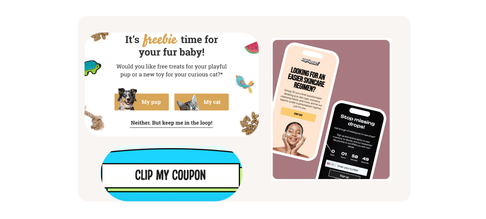
- Use their language. Using the phrases, “Show me my” or “Build my” insinuate that visitors are getting something that’s their own. By using the customer’s POV in the language, you’re making the offer irresistible and something they should claim/opt in to rather than run the risk of missing out.
- Set expectations. Use copy that lets visitors know exactly what they can expect from you — if you’re a B2B company then you’re likely trying to set up a demo or call. Use copy like “Talk to Us” or “Book a Time” to invoke a feeling of partnership, letting them know it’s a 1:1 conversation, not just a generic sales email.
- Self-selection. We included an example above but these CTAs can be used for more than just a preferred communication channel. They can be used to direct customers towards content they’re interested in or for B2B companies, the types of products and services a visitor is looking for. Examples include “ I want to”; “I am a”, or “I’m looking for.” This helps you show them relevant information and visitors find what they’re looking for quickly, win-win!
These are just a few of the many ways to increase the “click-ability” of your CTAs. Ultimately, you’ll want to make sure your CTAs are: clear, well-designed, and A/B tested.
Play around with adding some of these ideas to your CTAs to find what works best for your audience and watch your conversion rates skyrocket!