Not having your product pages optimized for mobile users is the number one mistake you can make when running an e-commerce store. From 52% in 2016, mobile e-commerce sales rose to 72% in 2021 of total worldwide e-commerce sales.
Because of the increasing number of mobile sales in the e-commerce industry, most business owners are now considering a mobile-first approach. One of the most crucial aspects of optimizing your e-commerce store for mobile users is getting the product pages right.
Mobile shoppers tend to be busy and want easy navigation and quick access to helpful information while browsing your product pages. To help you avoid common mistakes while optimizing your product detail pages (PDPs), our team put together the seven best practices you can’t miss implementing for a winning mobile UX:
1. Make Your Page Gesture Friendly
Using a mouse on a desktop is a totally different experience from using your fingers on your phone screen. So, to make the most of it, give your users the option to scroll, zoom in, zoom out, swipe, and drag using touch gestures. This will allow for smoother navigation and enhance the overall user experience.
Here are some of the most common touch gestures that you can provide your users with for the best experience:
- Double Tap: Tapping the mobile screen twice is often used for zooming in and out. You can also use double tapping for a quick add-to-wishlist feature.
- Pinch/Spread/shrink: Pinching the screen with two fingers and spreading to zoom in, and shrinking to zoom out is also an expected feature.
- Swipe: Users are accustomed to swiping vertically on mobile devices for scrolling or left and right for seeing product pictures. But, you can also apply this to quick actions inside a cart, like swiping left or right to remove items.
- Click and Drag: Clicking on an object to drag and drop it – just like a regular mouse would – is also expected on mobile. However, you can use this feature on eCommerce sites to allow users to drag products in or out of their cart.
Of course, you’ll have to provide visual feedback to communicate to users what they can or can’t do. For example, using icons like dots on product images lets users know there are more images they can see by swiping. The orientation of the row of dots (vertical or horizontal) will also inform which direction they should swipe.
2. Ensure the Add-to-Cart Button is Above the Fold
The primary purpose of your product pages is to encourage your customers to buy from you. For that reason, place the add-to-cart button above the fold instead of at the bottom of the page so that your customers never miss it, and you can increase your conversion rate.
Having a user scroll all the way down to the end of the PDP can turn ready-to-buy visitors into doubters.
Another opportunity for increasing your sales is to allow users to add items to their cart from any pages that feature products. As a rule of thumb, every extra step towards purchasing that you can remove is a win.
Tip: Mobile shoppers often buy more than one product per session and want to know if the products are successfully added to their cart. To make it easier for your users, add a product counter to the add-to-cart button to give them an uninterrupted shopping experience.
3. Save Data Across Devices
According to Statista, 80% of shoppers in March 2021 abandoned their cart without ever buying the product. Cart abandonment can happen for intentional or unintentional reasons, such as second thoughts or connectivity issues. Regardless, you want to keep cart abandonment to a minimum.
Many users initially add the products they like to their cart using their phones and return to the site on their desktop to go through them again before completing a purchase. They tend to move from their phones to their desktops because it’s more comfortable for typing billing data and, in most cases, they feel more secure. To make sure users find the products in their cart, save all your logged-in customers’ data automatically.
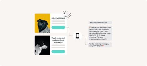
However, tracking sessions across devices is nearly impossible with regular UTMs or cookies. Instead, promote account creation through discounts and benefits like cross-device purchasing, so you can store customers’ session data (and therefore, their carts) no matter which device they visit your site from.
The other, most effective solution is to provide your customers with an app. Since apps live right on your customers’ devices, they’ll have more privacy and security while accessing their carts and favorite products.
You can reduce cart abandonment by making the checkout process seamless. Save users’ data so they don’t have to fill in the same details every session, and offer multiple payment options like payment-card scanning to give users more reasons to shop on their mobile devices.
4. Optimize Text for Small Screens and Use Icons Where Possible
Your customers don’t want to read huge blocks of text when deciding whether to buy your product. They are looking for specific answers, and your product description needs to deliver them in a few lines.
Avoid long product descriptions. Use bullet points instead of paragraphs to convey the benefits of your products to customers. Answer these critical questions in the first few lines:
- Who is your product for?
- What does your product do?
- What makes it unique?
- Why should customers buy your product?
Replace text with icons when applicable. Use icons to show users colors, sizes, and other available options. To make this more effective, you can utilize tap gestures and overlays to give your customers a better user experience.
Another key factor in driving more sales with compelling copy is getting the font size right. You can write the best product descriptions in the world, but what’s the point if your customers can’t read them? Hire UI/UX testers to get feedback on font optimization for different screen sizes.
5. Make It Easy for Customers to Access More Information
While most shoppers only care about a product’s essential information, there are always those who love to do thorough research before buying any product online. To cater to them, you need to provide additional details, but you must do so in a way that doesn’t scare away customers who want a short product description.
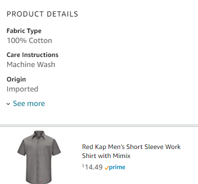
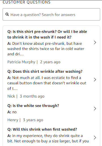
Buttons to the rescue! A simple See more button at the end of a product description would do the trick. Here’s an example of Amazon using a See more button to give users additional product information:
Another way to provide more information without breaking the flow of the product page is to add a Q&A section that answers customers’ most common queries. Here is another example of Amazon using their customers’ answers to provide shoppers with essential product information:
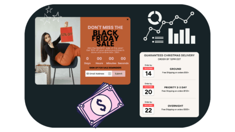
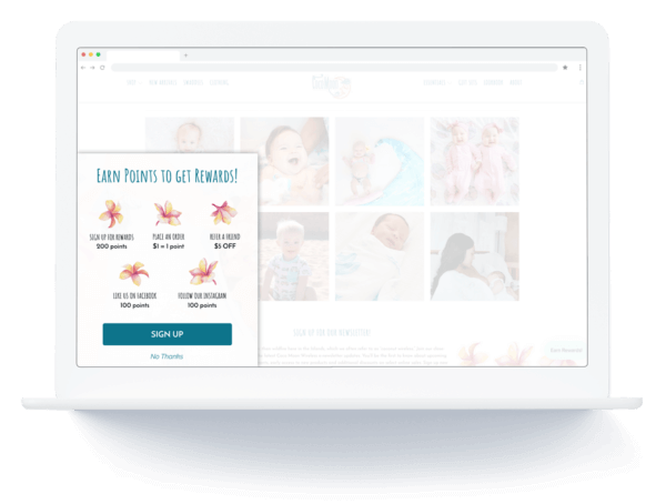
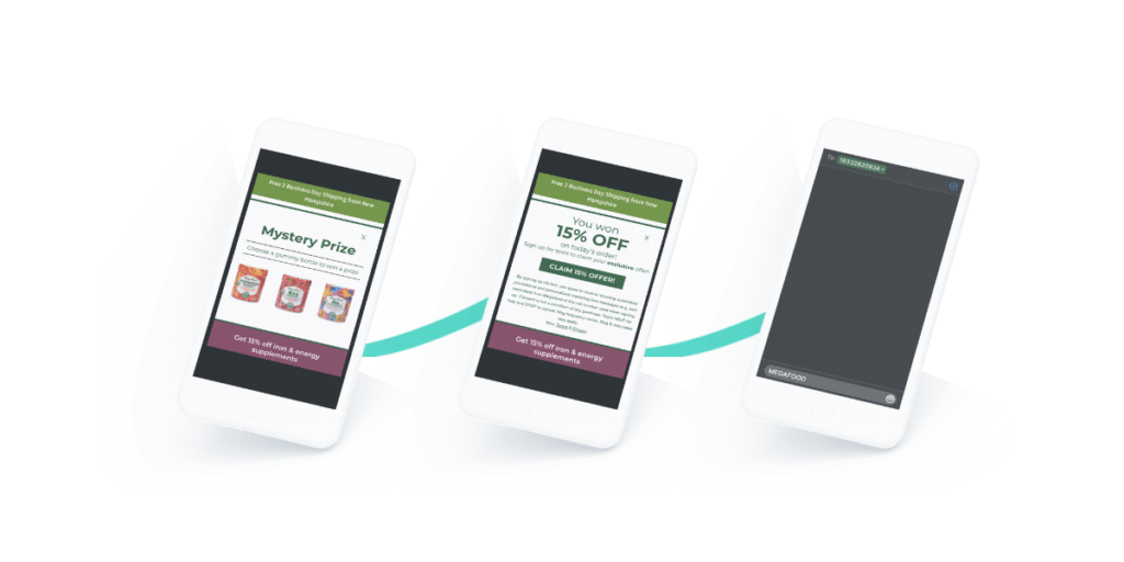
6. Build Mobile Friendly Pop-Ups & Use Fullscreen Top Layers
Pop-ups are the best way to promote additional offers or collect your users’ email addresses. But you need to do it right, or you’ll scare your users away.
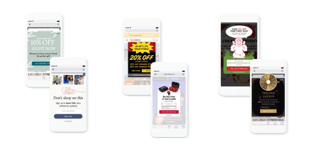
Window-on-Window (or Picture-on-Picture) pop-ups are common on desktops but, in most cases, are not mobile-friendly. Mobile screens are too small, so even small windows can feel strange and out of place. Sometimes these pop-ups’ close button moves outside of the screen, making your site unusable.
To ensure your pop-ups don’t push potential customers away and are mobile-friendly, follow these five best practices:
- Make your pop-ups non-obtrusive by letting them appear only after a specific action is completed. An example of this is to trigger a pop-up when users scroll to the end of the page, to avoid interrupting their reading. Allow users to close a pop-up by tapping outside of the box or a simple X button.
- Use a teaser to tell users what the content inside the pop-up will be before they click on it. It’ll save users from unwanted messages while attracting interested leads to a page.
- Keep pop-ups brief. Pop-ups are not the best place to add extensive copy. Instead, focus only on your core message and the CTA.
- Use space consciously. A great rule of thumb is to use a third of the screen size for pop-ups. It’ll give customers plenty of room to tap outside of them and prevent a cluttered or claustrophobic layout.
- Make pop-ups a fullscreen top layer. These pop-ups look better for important offers and feel more like an extension of your page.
Try to use #5 for click-triggered pop-ups, not surprise ones. The idea is to help users have a better experience and find better deals, not to make navigating your site harder.
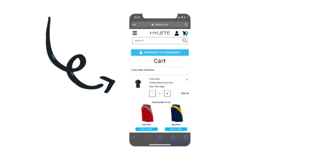
7. Add Upsell and Cross-Sell Recommendations
Adding product recommendations to your product pages is a great way to increase the potential size of a purchase. If done right, that is.
The recommended products should not take attention away from the main product page. Let’s say a customer is looking for a shirt and lands on the perfect one for herself. In this context, adding recommendations for more shirts would just confuse the customer.
Choose recommended products that complement the initial product for on-page recommendations (directly on the PDP). A person who bought a shirt might be interested in a tie, pants, or matching jacket.
On the other hand, the checkout page is a great place to add upsells. Many users might miss the recommendations on a product page, but it is impossible to miss them at checkout/in-cart.
Wrapping Up: PDPs Quick Optimization Tips
Optimizing product detail pages (PDPs) is crucial for running a successful online store. Although following the strategies listed above will help you improve your online store, there are a few more things to keep in mind to develop a successful PDP:
- Customer reviews and ratings
- Relatable product titles and descriptions
- Always visible Buy Now and Add-to-Cart buttons
- Appropriate visuals
- Technical optimization like image file size compressing and general page speed
When users are browsing through PDPs, they are on the verge of buying products. Having a perfectly optimized PDP might be the determining factor of whether you get the sale or not.
With more users shopping online with smartphones, businesses must provide a first-class mobile browsing experience to turn users into loyal customers and gain an advantage over their competitors – don’t fall behind!

Gabrielle Wooden
Gabrielle is a writer, specializing in multimedia storytelling and is currently the Senior Content Marketing Manager at Tapcart, mobile app builder for Shopify stores. With extensive experience throughout the digital marketing process, Gabrielle has written content and developed growth marketing strategies for brands of all sizes.