Want to be let in on a little secret? The average human attention span is no more than eight seconds. The average bounce rate of an e-commerce store? 45.68%.
Those are two insane numbers! People will get bored in less than eight seconds and a little less than half of the visitors to your website will leave before traveling to even a single page. This means you have less than those eight seconds to adequately capture someone’s attention before they leave your store website.
That’s why website optimization and user-experience (UX) friendly design has never been more important which applies not only to product pages but your onsite promotions as well. Between the SEO implications and your own bottom line, it’s clear you need to capture attention and quickly.
Below we’ll go over six design tips that will help you optimize your onsite experience and improve personalization (thereby holding their attention for longer) across all your website visitors.
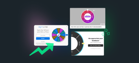
1. Don’t do too much
The golden rule of pop-ups is don’t overdo it. An overly busy design can be a deterrent to otherwise interested website visitors. A busy background combined with loud colors, too many elements (text and/or images) will overwhelm shoppers and they’ll likely miss your message in the process. Create designs that have clean lines and quickly draw consumers’ eyes to where you want: a bright CTA driving action, beautiful product photography, or the deal of a lifetime you’re offering subscribers. Whatever your promotions’ goal, ensure that it’s the focal point of your design with all elements pointing the way to it.
Pro Tip: Make sure there’s enough white space for an uncrowded design that’s visually appealing taking into account the size of any elements included (i.e. images or form fields).
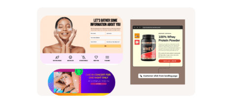
2. A picture’s worth a 1000 words
Imagery is one of the most powerful ways to capture attention and show visitor’s what your site is about. You can choose from:
- Full-background photo vs. smaller element
- Lifestyle vs. product imagery
- Photos vs. Gifs
- And much more
There are countless options for how to bring your brand’s aesthetic to life in a pop-up. Here at Justuno, we recommend testing which visuals are the most effective converters in your promotions. A/B test the list above to find which version produces the best results in converting your visitors. Some of our account managers have great success using lifestyle imagery over product photos, while others say that older audiences prefer traditional product photos.
The second part to keep in mind is making sure all photos you use are high-quality — that means no pixelated or blurred graphics allowed! Not only do they look unprofessional but they’ll detract from your promotion’s message and reduce shoppers’ confidence in your site.
The key here is knowing your audience’s preferences, what will pique their interest the most, and use high-quality visuals to deliver it.
Pro Tip: When creating Justuno promotions: PNGs are best for transparent background and JPEGs are best for photos.
3. Let people leave
Exit buttons are a critical component of promotions. Many visitors will get annoyed if you make it hard for them to close a promotion or even worse, don’t give them the option.
Now that’s not to say you can’t have a little fun with it, a common trend online is to use cheeky CTA copy for these like: I like to pay full price or discounts aren’t really my thing. It’s a great opportunity to inject some brand personality into your onsite experience and have fun with consumers. If you use this style of opt-out, we often encourage you to also include an X in the corner since sometimes consumers don’t understand that will close the pop-up, leading to a bounced session.
This is another time that A/B testing comes in handy, if you want to compare the performance of witty opt-outs vs traditional, button placement, etc. All that matters is you give your visitors a way out
Pro Tip: For mobile pop-ups, we recommend using buttons so there is more “clickable area” than just using an ‘X’ in the corner.
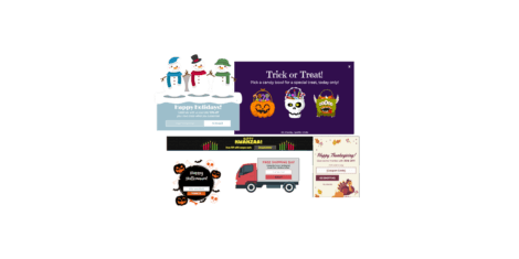
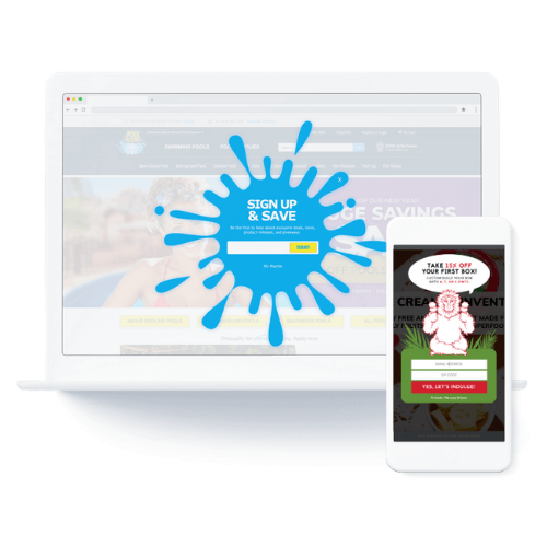
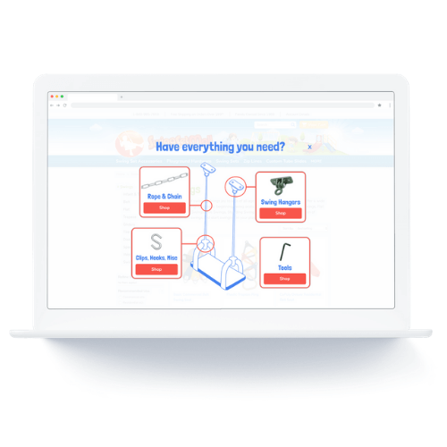
4. Mix it up
This isn’t something that will make sense for every brand, but changing up the shape of your pop-up from a square or rectangle to something like one of your products (ex. wine bottle) or a splat can boost conversions. Obviously this is something that needs to work with your branding and be done well, but this can take an otherwise run of the mill pop-up to the next level.
Incorporating products into your promotions can be a great way to not only customize the visual aspect of the promotion but also pique visitors’ interest about your inventory.
From customizing a spin-to-win to look like a charging pad, watch, or engine valve to wine bottle email opt-ins and dog-house shaped slot machines–there’s no limit besides creativity to the design possibilities with Justuno. Check out a few of our favorite designs over the years:
As always, not everything will work for every website and don’t force something that doesn’t fit with your site’s aesthetic. Pop-up design isn’t a one-size-fits-all strategy!
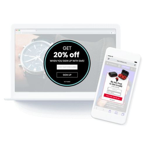
5. Make it easy: one-click shopping
Any onsite messaging you’re running on your website shouldn’t disrupt the user experience but give them something that helps or adds value. Utilize elements that make the customer journey quicker or easier in your pop-ups to boost conversions and reduce barriers to purchase.
This can be as simple as an add to cart button directly in the promotion. Use upselling and cross-selling strategies to boost AOV by showcasing relevant products, implement this in traditional pop-ups, in-page promotions, or AI-powered product recommendations for quick wins.
The fewer steps you ask visitors to take between browsing and purchasing will help reduce cart abandonment and move consumers down the funnel faster.
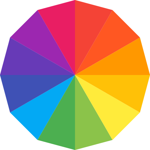
6. Color strategy
When choosing colors for your promotions, the first step is to stick to your brand guide and match the general aesthetic of your website. But that doesn’t mean you have to stick to four colors all the time!
High contrast in your UI elements is important, don’t want things to appear totally out of place, but important elements like: CTAs, the discount offer, etc. should have an accent to stand out from the rest of the promotion.
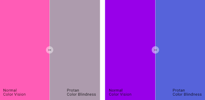
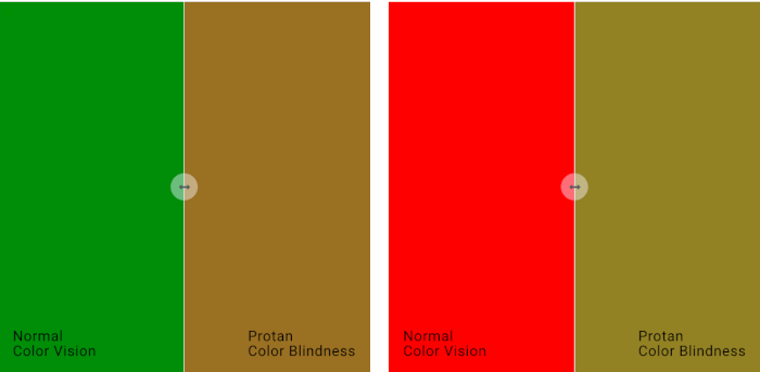
Another part of your color strategy should be to consider accessibility and how color-blind consumers may perceive your promotion. Common types of color-blindness cause the perception of red/green to be altered which is something to keep in mind when creating a marketing color palette.
Use a color wheel to help you find complementary colors (colors across from each other) for bright combinations or monochromatic shades (several shades of one color) for a more subtle vibe.
Color is a fundamental part of design and strategically choosing colors for maximum impact is one of the many ways to boost performance.
Final thoughts
Design is a key part of your pop-up’s performance. From a fundamental level of colors to aesthetically pleasing spacing/lines and strategic CTAs–these choices can make or break your promotion.
By staying focused on the consumer and their needs, you’ll create pop-ups that augment your onsite experience and ultimately, convert more visitors into customers.
Want to learn more? Check out our mobile-specific design suggestions or take your onsite messaging to the next level with animation.