Analytics are the cornerstone of our visitor conversion platform, and we firmly believe in putting data at the center of everything we do, including marketing strategy.
There’s 26 days left in the year and still lots of sales left to make, which means it’s a good time to take a look at your numbers so far this holiday season, and see if there are any glaring gaps to close this year.
We’ll take a deep dive into the Justuno Analytics dashboard to discover how you can leverage these insights to finish out the year strong, while setting yourself up for continued future success in 2020.
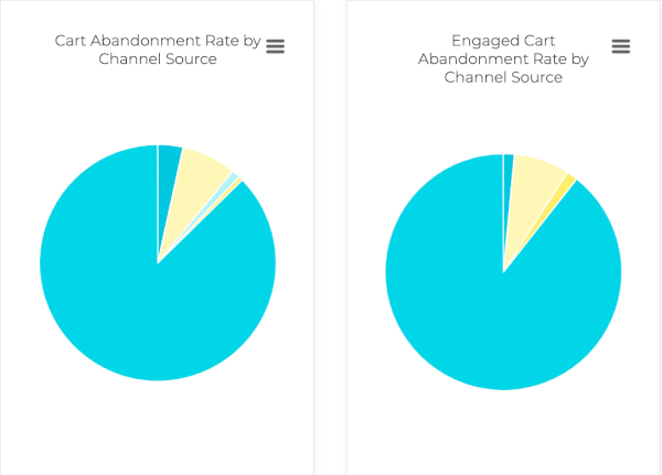
Cart abandonment
Located in your dashboard, the top of this tab shows you who’s leaving versus staying, along with who you’re recovering and who you aren’t. Below that you’ll find pie charts that break down the abandonment rate by traffic source, which is a great visual representation of lost revenue. Hover over each section to see the details of what you’re looking at. Compare the engaged cart abandonment to the non to see a comparison of how your promotions are reducing these rates.
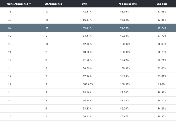
Below this, you’ll see the URLs where your visitors are falling off the most. Take a look at the top five: do they have something in common? Often times these are pages with poor design or user experience aspects, but can also be caused by the products themselves or technical factors.
One solution for bringing these rates down is to run exit offers that are triggered only on these URLs for specific products. If you can bring down the abandonment rate of these products with an incentive–try expanding your strategy across other low converters, boosting last minute Q4 sales numbers.
Cart abandonment is a fact of life in the e-commerce world, but with a little strategy and analysis, you can reduce these rates, rescue more carts, and turn yesterday’s abandoners into today’s purchasers.
Quick Tip: These abandoned cart pop-ups work best when they don’t require an email in exchange for the incentive, have bold copy, and an eye-catching design. The point is to get the shopper to take a second to reconsider their decision to leave, and ultimately, add the item directly to their cart.
Traffic source
Here you can see which of your holiday campaigns are working and which aren’t in terms of both driving traffic and actual conversions. Some sources may appear to be high traffic drivers on first glance, but upon deeper review, are converting at a lower rate or quantity. Others may drive fewer overall visitors, but the visitors are higher quality traffic, and worth much more in terms of their purchase behavior. Looking at AOV, ROAS, and LTV for this traffic is key to understanding whether or not you are on the right path, or if you’re expending your marketing efforts in the wrong areas.
This is also where you can review your UTM parameters. We highly encourage implementing UTM targeting parameters for differentiating campaigns, properly attributing traffic sources, and providing personalized on-site experiences. UTMs let you mirror copy and imagery on-site from the ad a visitor clicked through on. This promotes a consistent branding experience and reinforces the specific offer they engaged with. Customizing these pop-ups for each of your paid ad campaigns promotes optimal ROI and a more personalized visitor experience.
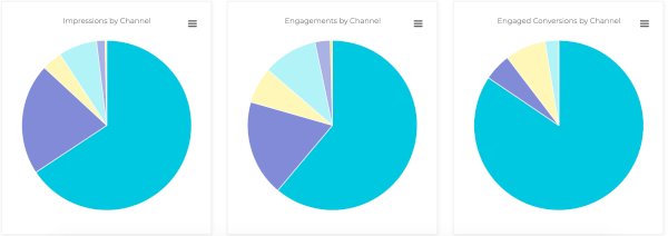
You’ll also find pie charts that break down impressions, engagements, and engaged conversions by channel. Check if these numbers line up as they move from impression to engagement–and hopefully conversion. You’ll see if visitors are dropping off in a specific location, so you can easily evaluate why there may be a drop from impressions to engagements.
Notice one source is overwhelmingly profitable and converting more than others (ex: paid ads vs social vs email)? If so, it may be worth it to put more resources behind those specific channels, driving more high-value buyers in these last few weeks of the year.
Quick Tip: There are many metrics to consider when evaluating traffic sources and off-site efforts, so make sure that you have a full picture of the value of the traffic before changing any budget allocations.
Promotions
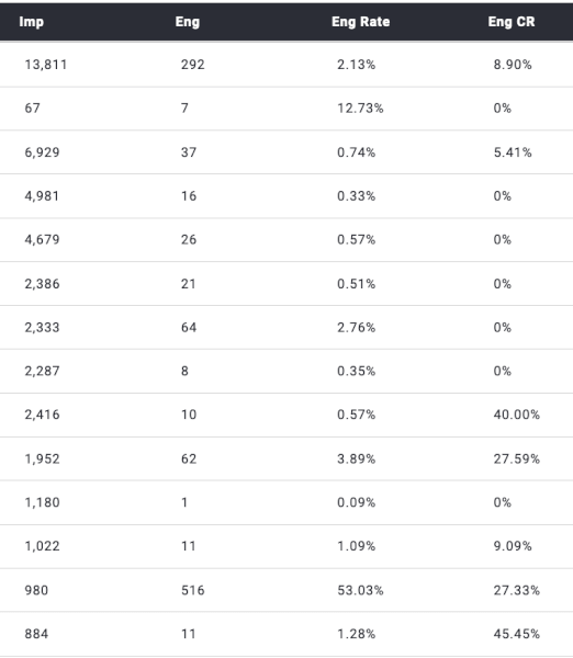
Here you can see all of your pop-ups compared to each other with our most used data points. If you’re looking for something that’s not showing, click the icon button and add your desired statistic to the chart.
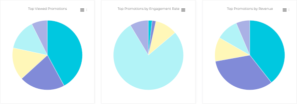
We’d recommend focusing on two of these statistics right now: how much revenue it’s driven and conversion rates. Some incentives or promotion types convert better than others, but during the holidays, with such an influx of traffic and unusual behavior, it’s hard to know for sure which one will work beforehand. Reviewing which pop-ups are high performers, whether it’s a free shipping threshold banner or exit intent offer; can offer guidance for the next few weeks.
Quick Tip: Sometimes the incentive is the difference, other times it’s the pop-up’s design itself. For example, gamification works well throughout the year but engagement plummets during BFCM. For low performing pop-ups, considering shaking up their design or switching out the incentive to see if conversion rates increase. All pop-ups aren’t created equal, so take the time to see which meet expectations and which are failing.
Final thoughts
If you’re not converting at the rate you want, you might be getting in the way of your own success. Site experience is key to conversions, and if you’re trying to do too much at the same time, it can quickly backfire. Too many promotions, pop-ups that don’t match your site, or those that are just plain intrusive are all non-starters during the holidays.
Let the data show you what’s working and what isn’t, because sometimes, it is isn’t what you initially expect. Keep a close eye on your conversions tab changes to see if any actions you take are affecting your numbers in a positive way (or just to track your site’s wins).
The good news is that there are still a few weeks left in the holiday season, so tweaking your strategy to finish the year strong is still possible–all it takes is a little bit of elbow grease and data analysis.