Attracting people to your website is just the first step. What’s really important is what happens afterward. When it comes to websites, first impressions are everything. According to research, a website’s first impressions are 94% design-related. So, if you have great products and produce excellent content but your site visitors aren’t converting as much as you would like (or not at all), you need to take a step back and analyze your website’s design. This is where CRO marketing and CRO website design can help!
The good news is that poorly designed websites can be improved! All you need to do is the customer journey and conversions in mind when creating a new design for your site.
In this post, we’re explaining what CRO marketing is, discussing the importance of web design in every conversion rate optimization strategy, and tips to help optimize your website design to maximize conversion rates.
What Is CRO Marketing?
Conversion rate optimization marketing is the strategic planning of a website’s design, content, and CTAs with the goal of increasing the percentage of users who take a desired action — such as signing up for email/SMS newsletters, registering for a seminar, completing a personal information form, buying a product, etc.
With an estimated 223% average ROI from CRO tools and nearly 60% of business respondents saying that conversion rate optimization is essential to their overall marketing efforts, the subject is definitely worth exploring. CRO marketing improves the overall customer experience, boosts engagement, reduces bounce rates, and improves dwell time and brand affinity, resulting in improved sales and increased revenue.
In short, optimization is important since it increases the effectiveness of your marketing efforts, and businesses that don’t employ CRO may be losing out on potential revenue and competitive advantages.
Why Is CRO Website Design Important?
Humans are visual creatures. In comparison to the rest of the animal kingdom, our other senses are behind, so we rely heavily on our vision to perceive, process, and comprehend our environment. Considering the fact that Google found people determine whether they like your website in just about 50 milliseconds…visual interactions are typically the most powerful and long-lasting.
All of this means that your website’s design matters a lot when it comes to conversions. The days when your website was a secondary resource are long gone. If you want to compete in today’s market, you need a website that converts. A well-designed, functional website can improve user experience and boost customer confidence in your company or brand. Clever website design combined with conversion rate optimization can significantly increase leads and sales.
A website that focuses on conversions is a lead generation powerhouse. It not only directs consumers to the information they need, but it also arranges that information so that you can gather valuable user information and later use it in marketing campaigns to convert those visitors into paying customers.

Photo by Austin Distel on Unsplash
How to Optimize Your Website Design for CRO
You can optimize your web design for maximum conversions by approaching it with the following ten rules in mind.
Simplify the navigation
People don’t typically visit a website and convert right away and if your traffic does, then you’re one of the lucky ones. Usually, people browse a bit, navigating to different pages and scope out your offerings. If they can’t find what they’re looking for, these website visitors won’t be able to convert.
Eliminating unnecessary menu options is the simplest way to make website navigation simpler. In addition to making the menu more aesthetically pleasing, this will ensure that there are no confusing or conflicting navigation links, making it simpler for website users to find what they’re searching for and resulting in higher conversion rates.
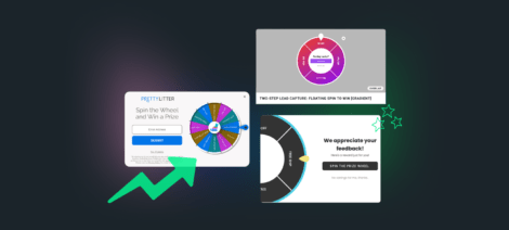
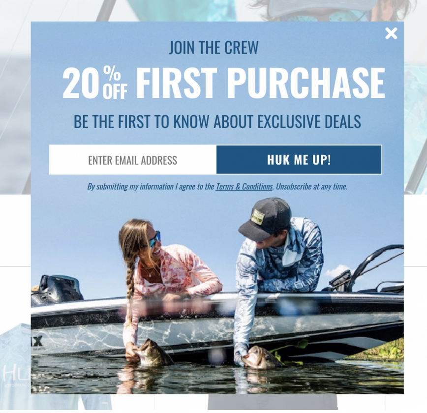
Don’t use too many pop-ups
Bombarding users with too many pop-ups can make them annoyed, especially when they first arrive on your website. We’ll be the first to tell that is a terrible customer experience. We want you to put thought and effort into when and how often you’re leveraging them.
Research has shown that it takes eight engagements with your brand on average before a buyer decides to make a purchase. Therefore, a pop-up probably won’t persuade them, especially if it’s their first visit. But you can capture their email or phone number to start nurturing the relationship offsite via owned channels. If that doesn’t work, you can employ exit offer pop-ups and a next step in the customer journey.
Exit offer pop-ups are pop-ups that become active when the user is about to leave your website after they have had a chance to browse it. At this point, they are more inclined to make a purchase or share contact information with you because they’ve learned more about your brand and its offerings since initially landing on your site. In fact, exit offer pop-ups have, in some cases, increased conversions by 167%!
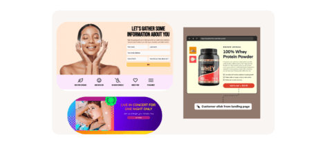
Make your form fields shorter
If you are using forms as a conversion point on your website, make sure they are properly optimized. If your forms are too long or complicated, most people aren’t going to be willing to fill them out.
Reducing the number of required fields is the best strategy to improve the form’s design. A study by Hubspot found that overall, more contact form fields result in lower conversions. If someone isn’t ready to commit enough to your brand to make a purchase, they’re probably also not ready to commit to a very long form asking for a lot of private information. Therefore, be sure you’re just asking for information that’s absolutely essential for your business goals and an optimized customer experience.
Decreasing a single form field can help improve the conversion rate by 50% and contact forms with three fields have proven to be the most converting. We recommend the channel (email, SMS, social media) you’re trying to get them to opt-in to and one additional piece of zero-party data for personalization of the subsequent welcome flows. What that additional field is should be determined by what can make the most impact for personalization based on your marketing and audience needs.
Make site speed your top priority
Don’t let your website’s performance be jeopardized by your design decisions. If your site takes too long to load, visitors will get frustrated and leave. According to Google, a one-second site speed improvement may increase conversions on mobile devices by up to 27%.
So, what are good load times? A recent survey found that 47% of users expect web pages to load in two seconds or less. When a website takes longer than three seconds to load, 40% of visitors leave, and 75% of visitors won’t visit a website again if it takes longer than four seconds to load.
Websites with complex designs and too many videos, product images, GIFs, or other big files typically load more slowly. That’s why you need to get rid of any clutter and unnecessary visuals. Your loading times will be quicker if you maintain a simple, aesthetically pleasing CRO website design.
Break large blocks of text
Large blocks of written text can be a real conversion killer! People simply don’t have to read lengthy paragraphs of text before taking an action. Therefore, you must find a way to convey your message as briefly and effectively as you can.
Consider using brief bullet points instead of paragraphs and lengthy sentences to break up massive blocks of text. Bullet points are simpler to read and much more aesthetically pleasing.
Using clear, high-quality images combined with short text is another excellent way to explain things on your website. However, keep in mind that although incorporating photos to enhance the appearance of your website is undoubtedly a good idea, you shouldn’t go overboard. Your site visitors will become overwhelmed if there are too many visual components packed into a small space. In addition, as we mentioned before, images can increase your site’s weight, resulting in slow page loading times.
Use white space
The space between design elements, commonly known as white space or negative space, can be just as powerful as other design aspects for boosting conversions.
White space is crucial in helping designers express which elements of a web page should stand out as the most important ones. It also creates a welcoming layout that encourages users to stay on the website longer and keep browsing. Research has found that adding white space around text and headers improves user experience and enhances user attentiveness. In addition, white space eliminates distractions and can boost comprehension by 20%, which is vital to messaging. So, rather than trying to fill it with text, photos, and links, consider leaving the majority of the page a blank white space.
Optimize your calls to action (CTAs)
The CTA is one of the most important elements for website conversions. The CTA is the tool you provide for visitors to take their next action towards becoming your customers. A good, visible call-to-action button helps website visitors through their buyer journey but when you get CTAs wrong, they can be completely useless.
Only 47% of sites have CTA buttons that can be spotted in three seconds or less. If your potential customers need to scroll, click a link that takes them to another landing page, and then hunt for a button tucked down in the bottom corner, you won’t have good conversion rates. Your call to action must be visible on all your web pages at all times. It should be clear so that when a visitor is ready to convert, they know exactly where to click. To ensure that your CTA is visible regardless of how a user navigates, try pinning it to the top menu bar.
Also, rather than only emphasizing the action you want the reader to perform, try to focus on the advantages the reader will gain if they follow your CTA. For instance, you may say, “Get a 40% off code!” rather than just, “Join my email list!” This is a great way to make the CTA more appealing and tells users exactly what they are going to get. Another tactic is to lean into branding and personality for your CTAs. Stand out from the crowd and make visitors understand what they’re joining when they become a part of your subscriber base and community.
Optimize your website for mobile
Today, nearly 60% of all web traffic is generated by mobile devices. More than 92% of internet users access the internet using a mobile phone and 60.9% of Americans are mobile shoppers. This means that if your website is not mobile-friendly, you will quickly lose mobile web users.
One option is to build two websites, one for desktop computers and one for mobile devices. However, this method will require you to maintain and update two different sites simultaneously, which means two times the work. As an alternative, you should consider investing in a responsive website design. Responsive website designs can adapt to any screen size to ensure a seamless user experience.
Optimize your checkout process
Another thing that could potentially harm your conversion rate is your checkout process. Consider how many steps are required for a visitor to complete their purchase. If there are too many steps, chances are they will give up and abandon their shopping cart. Research confirms that the average cart abandonment rate is 69% and 17% of shoppers abandon their carts because the checkout process is too complicated or too long.
The good news is that you can reduce your cart abandonment rate by improving the design of your checkout pages by removing any unnecessary steps. Think of it this way: with each step, the customer has to complete, they have a chance to change their mind or run into an issue. Therefore, make sure your checkout pages take the least amount of scrolling and that customers can complete everything on a single page. In addition, ensure that the CTA that says “buy” or “purchase” is prominent, large, and clear.
Consider leveraging one-click checkout options like Signed-In Shopping by Shop Pay—place a layer for this in your Justuno lead capture, it will prompt visitors to log into their accounts and then auto-save their incentives to apply at checkout. Plus, as a Shop Pay user, their information is already saved accelerating time to purchase & ease of use! This feature is available exclusively for Justuno customers on Shopify!
Use social proof
Social proof is a strategy used by businesses to increase conversion rates by reassuring the customer that other people have purchased similar products or used the same services. These days, almost 70% of people will check product reviews before deciding to make a purchase. Online reviews are 12 times more trusted than product descriptions and can increase the likelihood of purchase by up to 270%.
Customer testimonials are probably the easiest type of social proof to use. According to research, 88% of people trust customer testimonials just as much as they trust recommendations by friends and family. You can display customer testimonials on your website in a number of ways, including simple quotes scattered throughout the site (make sure to use a picture of the customer wherever possible to increase credibility), inside exit offers or cart abandonment pop-ups, via videos, etc. Customer testimonial videos show real customers expressing their experiences with a product/service. Video testimonials also give viewers a visual experience that feels much more natural and relevant, which makes them even more effective.
The Bottom Line
Now that you have a deeper understanding of CRO marketing and CRO website design, you can begin developing a conversion rate optimization strategy and implementing the changes you need to turn visitors into customers.
The tips provided in this article will help you build a solid foundation. From there, you can expand and research what’s right for your business. Remember, even the smallest optimizations can have a huge impact.
Lastly, don’t forget that CRO is an ongoing process and that there’s always room for improvement. No website can be 100% flawless, so be sure to employ split testing to continuously improve your CRO web design. Split testing or A/B testing means using various iterations of the same component to determine which works better. Anything and everything can be split tested, including headlines, CTAs, landing page designs, popup campaign designs, and more.Ready to get started with a more optimized website experience? Sign up for a free, 14-day trial of Justuno to implement personalized messaging, start testing promotions, and so much more!