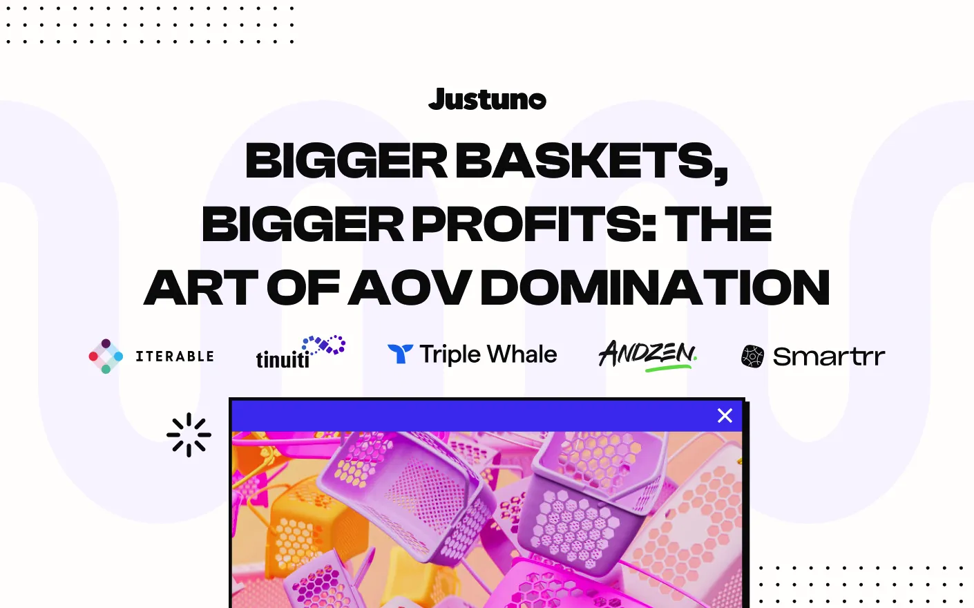
Top Use Cases
Check out live examples of top performing strategies
Use the logos, colors, and font types below for co-marketing initiatives with Justuno. If you need more downloadable assets, please reach out to the team at info@justuno.com and we can assist you. By downloading or using these assets in any way, you agree to follow our brand guidelines and represent Justuno as directed.
App Icon

If you’re looking for a partner or certification badge,
please reach out to partners@justuno.com to receive yours.
HEX – 00AA45
CMYK – 96/0/96/0
RGB – 0/170/69
HEX – 59D8C9
CMYK – 67/0/15/0
RGB – 89/216/201
HEX – F2B344
CMYK – 5/28/69/1
RGB – 242/179/68
HEX – 172327
CMYK – 81/52/53/54
RGB – 23/35/39
HEX – F8D8D3
CMYK – 5/14/10/0
RGB – 248/216/211
HEX – F9F5F2
CMYK – 3/3/3/0
RGB – 249/245/242
4.6/5 — from 200 reviews
4.7/5 — from 2,300+ reviews