Let’s be real; we’ve all been online shopping, adding items to our cart left and right…only to abandon the entire thing 10 minutes later. We clearly liked the products enough to add them to our metaphorical bag, so why didn’t we follow through?
It’s a phenomenon that every online retailer experiences, with an average cart abandonment of 7 out of every 10 carts. But even before you get to the point of cart abandonment, there are many other points for shoppers to fall off. There’s browse abandonment, hard bounces, and just generally exiting traffic to consider.
That’s why it is so important for marketers to create the ultimate exit strategy to provide each one of these segments with the right message at the right point in their journey that keeps more visitors on your website and drives them toward conversion.
The key to a successful exit strategy is figuring out what the question, concern, objection, etc., is and seamlessly presenting the solution to shoppers.
Even better? Removing the roadblock before it even occurs to your shoppers.
So let’s dive into what makes up successful exit strategies, the difference in exit offers vs. browse abandonment vs. cart abandonment, why each audience is important, plus showcase some real-life examples and results from Justuno customers.
Standard Exit Offer
What Is An Exit Offer?
An exit offer is a pop-up that fires when a visitor comes to your website and goes to exit without spending any real-time on your website. They didn’t click through to an individual product page or view multiple pages in their session, aka “browse.”. This visitor has been to one or two general pages of your website and is now going to leave.
Enter: The Standard Exit Offer
Why You Need An Exit Offer
Why do you need an exit offer pop-up? To put it simply, any traffic you’ve driven to your website is worth trying to save! This audience is very much at the top of the funnel, so while they’re not super likely to convert same-session from this exit offer, it’s all about getting them to pause. Maybe that leads to a conversion today, but it can also lead to an email/SMS opt-in, a good first impression, and, eventually, a return visit with higher buyer intent.
In addition to just being an effective marketing tool, exit offers are good for your website’s overall performance by reducing bounce rates. Your bounce rate tracks the percentage of visitors who land on your website and then leave without visiting any other pages.
High bounce rates can signify a number of potential website or overall customer experience issues. They can also negatively affect your search engine rankings since Google interprets them as your website not being helpful in solving the searcher’s query.
Exit Offer Best Practices
First off, we recommend leveraging UTMs to create targeted exit offers for all paid acquisition campaigns you’re running, i.e., Google ads, social ads, influencer marketing, etc. This improves the potential ROI on what you spent to drive them there (if your welcome offer wasn’t quite compelling enough) and presents an opportunity for added personalization based on their referring source.
Next, we recommend creating separate exit offers for your mobile traffic and desktop traffic. While Justuno’s promotions are responsive, the actions that trigger these exit offers will differ by device.
For desktop traffic, exit behavior is defined as breaking the screen or moving the cursor toward the corner, while for mobile traffic, it’s the back button or idle time. Not to mention the size of screen real estate available will have an impact on which incentive/message you choose to use!
Pro Tip: Some of our customers are experimenting with 100% scroll-triggered pop-ups when no item has been added to the cart while on a product description page—this visitor is someone who just went all the way to the bottom of your PDP, indicating interest & intent so give them a nudge!
Now, onto the design of your exit offer—since the whole point of an exit offer is to prevent the visitor from leaving your website, it should be anything but subtle. We recommend placing exit offers in the center of the page (full screen on mobile) and overlaying (dimming) the rest of the screen. The darker screen behind the pop-up will increase contrast, which is a key element in the design of exit offers, along with strong visuals, clear copy, and a compelling incentive.
Pro Tip: Use one of our hundreds of pre-built templates to get started in less than two minutes—including exit offers & cart abandonment pop-ups with best practices already built in! Sign in to your account or start a free trial to get access!
Finally, focus on keeping the message positive. A common mistake marketers make in exit offers is using “confirm-shaming.” Confirm shaming is where the pop-up messaging degrades the user for not accepting the offer or trying to leave.
The best practice here is to ensure that you are using positive (or at least neutral) messaging and to ensure that you are creating a positive brand experience.
You can use funny or joking language; just ensure you fully understand your target audience and know what will appeal to them. Don’t force something that isn’t there!
Exit Offer Examples
Below are some of the most popular and successful exit offer strategies we see:
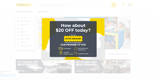
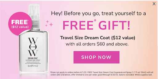
1. Discount ($ or %)
This is the most common incentive you’ll see on an exit offer since a discount is perfect for the audience who you don’t know much about. Everyone likes to save a little money, especially when it’s something they’re just learning about, so it’s a great motivator to stick around and learn more!
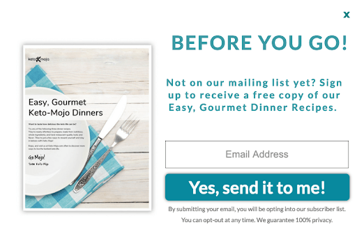
2. Lead Capture
A quick disclaimer that we don’t recommend using exit offers as your main source of list growth…BUT they can come in handy for targeting traffic that closed your welcome/new visitor offer without opting in since they didn’t know enough about your brand yet to commit to a newsletter. At the point of exit, they’ve had a chance to learn a little more and maybe more primed to opt in this time around.
Lead captures in exit offers are an especially valuable strategy for traffic coming from paid media campaigns since you’re doubling down on the opportunity to continue the conversation later on and potentially improve your ROAS.
Pro Tip: Always turn on Audience Sync with your Justuno lead captures to automatically sync emails collected on your website to ad audience managers on Google + Facebook for better re-targeting and prospecting. Join our weekly office hours session to get 1:1 help with your Justuno accounts & inspo for new campaigns.
3. Best Sellers
Just want to keep it simple? Then put your best sellers (or a CTA sending them to that product category) front and center in the exit offer. This strategically drives traffic to the products with the best possible chance of driving conversions, and for those who didn’t take the time to open up your nav menu—a compelling reason to stick around.
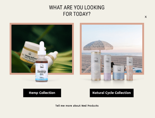
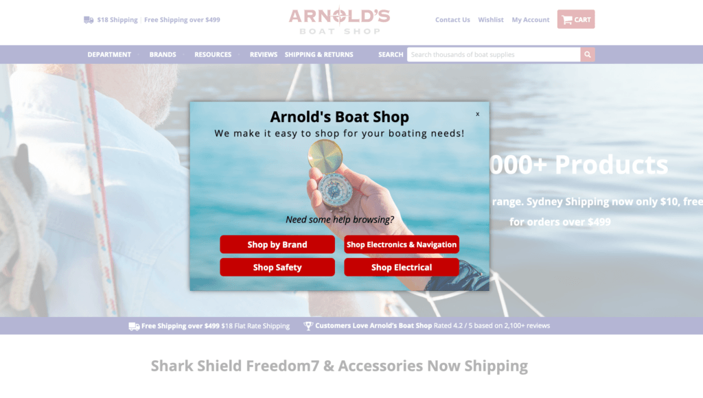
4. Website Navigation
Sometimes, visitors can get overwhelmed or have a hard time finding what they want, especially if they landed somewhere other than the home page. Use exit offers to present a few options that are most likely to pique their interest or be what they were looking for.
Something great about this pop-up is that you can analyze the clicks of each CTA for data-based choices on any adjustments to where or what the CTA does.
Chat with our team to learn more about tracking your CTA clicks and other conversion optimization strategies.
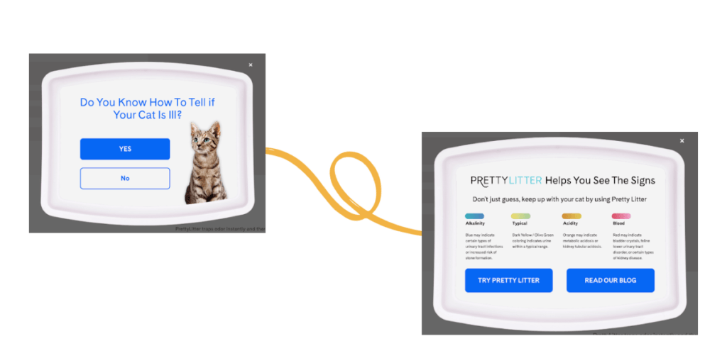
5. Social Proof
If your brand is newer or smaller, this may be the first time that visitor has ever even heard of your brand. That may lead to high bounce rates for no reason other than a lack of awareness or confidence. Placing social proof in your exit offers can be crucial when trying to build up a reputation and trust.
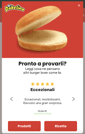
Pro Tip: Use Justuno’s advanced targeting rules to show geo-targeted messages or different languages to different countries, like the Italian example above!
Browse Abandonment
What Is Browse Abandonment?
Browse abandonment occurs when a visitor has been shopping around your website, checked out multiple products, and then goes to leave. The important key here is that they have NOT added anything to their cart but have demonstrated a higher level of intent/time on-site than the traffic we just covered in standard exit offers.
Why You Need a Browse Abandonment Pop-Up
Browse abandoners target that middle traffic group, those who are higher intent and likely know enough about your brand to be seriously considering a purchase. They’re shopping around, and all it takes is just a little nudge to get them to take that leap and add something to their cart. So, help these shoppers over that hurdle with a browse abandoner that provides value and removes objections!
Browse Abandonment Best Practices
The key to a compelling browse abandoner is understanding the roadblocks to purchase that consumers have with your product and helping them overcome them. This audience hasn’t felt compelled enough to click ‘Add to Cart’ yet, so it’s important to give them resources or reasons to do so. There’s a bit more nuance to a browse abandoner than the standard exit offer—since the right message and strategy will heavily depend not only on your target audience but your brand itself.
One important thing brands can do to be proactive about their abandonment strategy is to look at the average number of pages visited per session and then trigger a browse abandoner pop-up to fire one page before that. For example, if the average visitor travels four pages on your website before leaving, set up a browse abandoner pop-up to fire on the third page of their visit!
Browse Abandonment Examples
Below are some of the most popular and successful browse abandoners we see:
6. Discount ($ or %)
Obviously, a discount is a common tactic again in the browse abandoner; it’s an easy way to remove price from the equation and give shoppers a little “oh well, if it’s 20% off, I’ll do it” excuse. This is most successful for low-consideration products where price is the biggest factor.
7. Product Quiz
A product quiz is perfect for browse abandonment pop-ups since it provides exiting visitors the opportunity to find the right item to suit their needs + a more personalized experience. This is an invaluable source of zero-party data to use not only for personalization in the moment but for larger planning and marketing efforts.
If you sell something that is high consideration or has a lot of variations to choose from, then a product quiz will be a great fit. It provides more value than just a discount code since your visitors may be looking for education and guidance.
Justuno customer Midland implemented one of these as a part of their exit strategy and kept 20% more traffic on their site who were otherwise planning to leave.

8. Best Sellers
Again, the best-sellers are a great choice for browse abandonment, too—they’re the products most likely to lead to a same-session conversion, so why not put them front and center. Since these visitors were looking and unable to commit to something yet—maybe one of your top items will grab their eye.
9. Free Shipping (Threshold or All)
Shipping costs are one of the biggest reasons for cart abandonment (more on that later), so why not head that off from the start. If shoppers are unsure about what they might have to pay if they order from you, they’ll leave to go purchase from Amazon, where they know it’ll be free, and come in two days.

Proactively remove that potential abandonment reason by promoting the availability of free shipping. If you only offer that on orders of a certain amount, use a dynamic free shipping threshold banner showing them how much they need to spend to unlock it.
10. Content/Resources
This is kind of a catch-all browse abandonment—where you combine one or more of the options above into one pop-up! Depending on your target audience and their needs, this might be a great way to lay out all their options and give them the resources they need to stay on your website.
A great example of this is the Laura Geller promotion below, where they emphasize: free shipping, a product quiz, customer support, and social proof all at once. Perfect for a make-up brand where a quiz can help with shade/product fit, customer support can answer product questions, and social proof will increase confidence!

Cart Abandonment
What is Cart Abandonment?
Cart abandonment is when a visitor has actually added at least one item to their cart and then goes to exit from the website. Whatever the reason for cart abandonment, millions of online shoppers do it all the time. So let’s talk about some of the roadblocks that customers face that lead to this, but more importantly, how we can nudge them toward completing the checkout process. Some of the most common reasons include:
- Shipping costs
- Checkout issues
- Lack of payment options
- Window shopping
Why You Need a Cart Abandonment Pop-Up
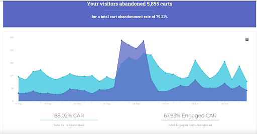
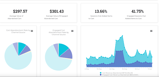
Like we said at the very beginning of the blog, 70% of carts, on average, are abandoned—think about what saving a few would mean for your bottom line. These are typically the highest intent shoppers (when compared to the standard exit and browse abandonment segments we’ve covered above) and those closest to converting.
Justuno customers can look in their analytics dashboard at the cart abandonment section to see top metrics and areas for improvement. This helps you build a data-based exit strategy to retain more visitors and convert them into customers.
Cart Abandonment Best Practices
In multiple studies conducted, the top reason behind cart abandonment was when customers encountered shipping costs. We’ve grown accustomed to the Amazon age, where you can get it shipped for free in two days or less. The expectation has been set, and offering free shipping is a top recommendation for keeping those sales.
Use Justuno to create a free shipping website banner that you display across your site or in a pop-up that shows up when those with items in their cart begin to exhibit “exit-like” behavior. Though it can be more effective to showcase it earlier on in their journey to remove the concern entirely!
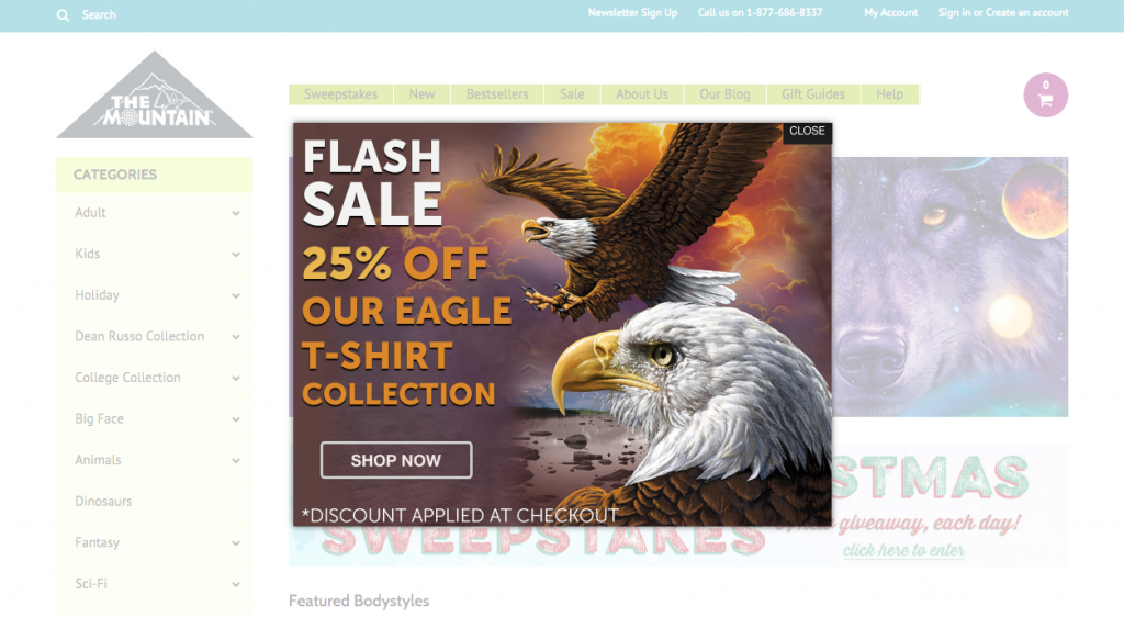
One of our clients, The Mountain, was able to decrease cart abandonment by 30% by implementing this type of campaign. They are a great example of how to use Justuno to help you recover carts and close more sales.
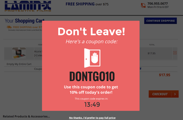
Another roadblock that most customers mention is simply that what they added to their cart is more than they wanted or can spend–the online version of window shopping, if you will. Some of these customers never had the real intention to complete their purchase, but if you were able to offer a discount when they went to leave, it could nudge them through the purchasing funnel. Check out the example below that you could show to people about exiting the cart or checkout pages.
Always include a CTA that takes them directly to your checkout page in the cart abandoner—the faster you can get them into the checkout process itself, the more likely they are to follow through.
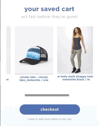
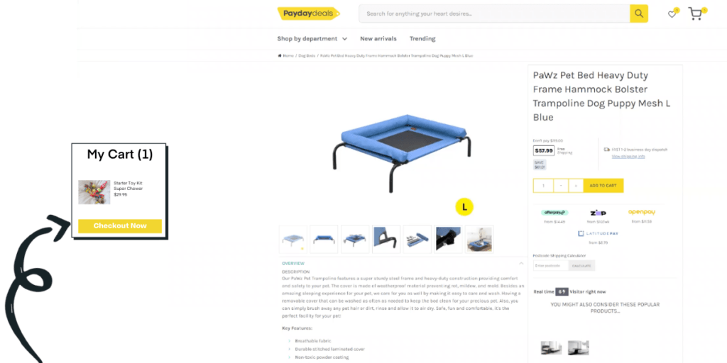
Justuno allows you to dynamically pull in the actual products from their cart to the cart abandoner pop-up for the ultimate personalization boost. We highly recommend going this route as it visually reminds them of exactly what they could miss out on and, when used in tandem with some of the messaging examples below, is a simple, highly effective strategy.
There is a sub-set of your cart abandonment segment that is more accurately defined as “Checkout Abandonment”—these are shoppers who have items in their cart and, depending on your cart set-up (AJAX or slide-out cart vs. cart page), are going to exit from those or the checkout page itself. Justuno allows you to target both cart and checkout URLs, plus visitors who have items in their cart with the AJAX cart open that are exhibiting exit indicators. This is a very high-intent segment that should be served your best possible offer to truly “save” the purchase they were about to make!
Not sure where to get started? Our Managed Services team can handle all the heavy lifting when it comes to creating the perfect cart abandonment strategy, or try out a conversion audit with our team to see where you can implement fixes yourself.
Cart Abandonment Examples
Below are some of the most popular and successful cart abandonment pop-ups we see:
11. Promo Drawer
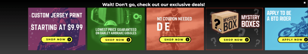
A promo drawer is like a product recommendation, and a banner had a baby—you can promote several offers, exclusive sales, individual products, content, etc., all in one place. They’re more noticeable than a banner but not as interruptive as a center pop-up.
A great example by BTO sports is below. They have a large catalog and many types of riders that come to shop, so having many offers showcased is ideal for their cart abandonment approach until they’ve narrowed down what the visitor is looking for.
12. Discount
It’s been at the top of all three lists now, but sometimes a discount is just what it takes to push them over the edge to convert. This is great when paired with another tactic like “low inventory,” a timer, or other kinds of FOMO to encourage a same-session checkout or risk losing out on their exclusive deal.
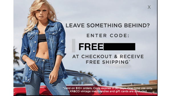
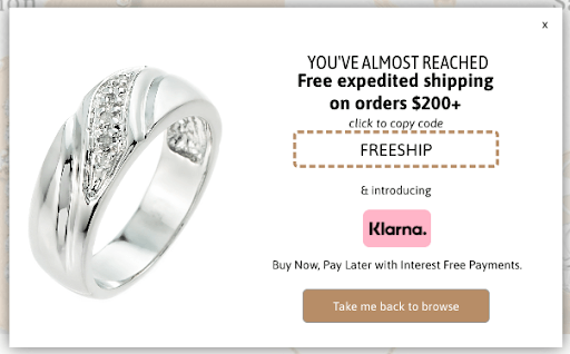
13. Free Shipping
Unexpected shipping costs are the biggest cause of cart abandonment, so while we suggest making your shipping transparent earlier in the journey—free shipping can be a great motivator for cart abandoners. Reserve it for those at a certain dollar value or with specific items in their cart for an air of exclusivity.

14. Return Policy
Sometimes cart abandonment occurs because while shoppers liked the item enough to add it to their cart, they aren’t 100% sold on it. That’s where proactive returns policy knowledge or a guarantee is perfect to surface in a cart abandonment pop-up, encouraging them that their purchase is no-risk and removing hesitation. Plus, this method is a great non-discount strategy that doesn’t impact profit margins and builds trust in your brand.
Pro Tip: This is a great option for fashion/apparel and other industries with higher product return/exchange rates.
If you offer product warranties, this could also work here instead—instilling trust because you stand behind your product. As a cart abandonment strategy, though, it’s best if this warranty isn’t also an upsell :)
15. Social Proof/UGC/Reviews
Cart abandonment can be caused by concerns about how products will really look or perform (this is especially true of first-time shoppers), so place social proof like reviews/testimonials in the pop-up to give them more confidence.
Use Justuno’s advanced targeting rules to set these up to trigger based on certain products in the cart for maximum personalization and relevance.
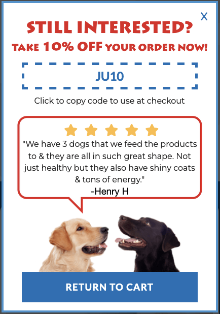
Pro Tip: This is great for CBD, fashion, pet care, and other industries, where reviews are especially helpful to shoppers choosing between products.
16. BNPL
Buy now, pay later (BNPL) technology is increasingly common on e-commerce sites because consumers love the easy four installments, and for those with higher price points, this is a great way to help shoppers afford their carts today. While it’s a best practice to display this option at various stages on your website prominently, it can be a great cart abandonment pop-up to salvage high-value carts.
Payment platforms have turned into conversion funnels themselves, and having them can be the difference between making a sale and losing out on a customer. Even if you do not want to leverage BNPL, one-click checkouts like ShopPay, AmazonPay, or Paypal make checkout easier for customers and can streamline your BOFU, so whatever you are using—put it into a cart abandoned!
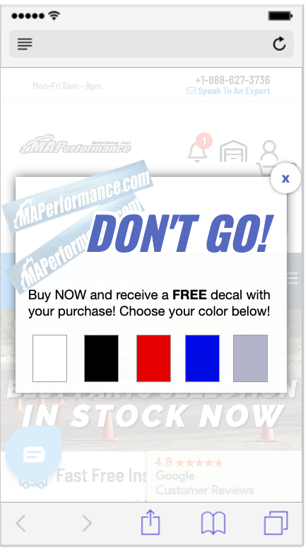
17. Free Gifts
Free gifts are a great option to use in cart abandoners, especially if it is something you can’t purchase on its own, making it a real buy now or it’s gone forever FOMO situation. This will work best for brands with a loyal, cult following where specialty items will be held in high esteem.
But it doesn’t have to be anything expensive or fancy—sometimes, just stickers or brand swag is enough to move the needle. The example below is a great one that even lets the shopper select their preferred color giving more ownership over the gift and increasing the likelihood of conversion.
18. Store Locator
If you have brick-and-mortar stores or are stocked in other retailers and shipping times are a reason for cart abandonment—then leverage a geo-targeted cart abandoner to help potential customers get products same day. Justuno’s advanced targeting can get all the way down to zip codes in the US, so you can be sure that this experience will be truly personalized and is a great way to drive in-store results with online marketing

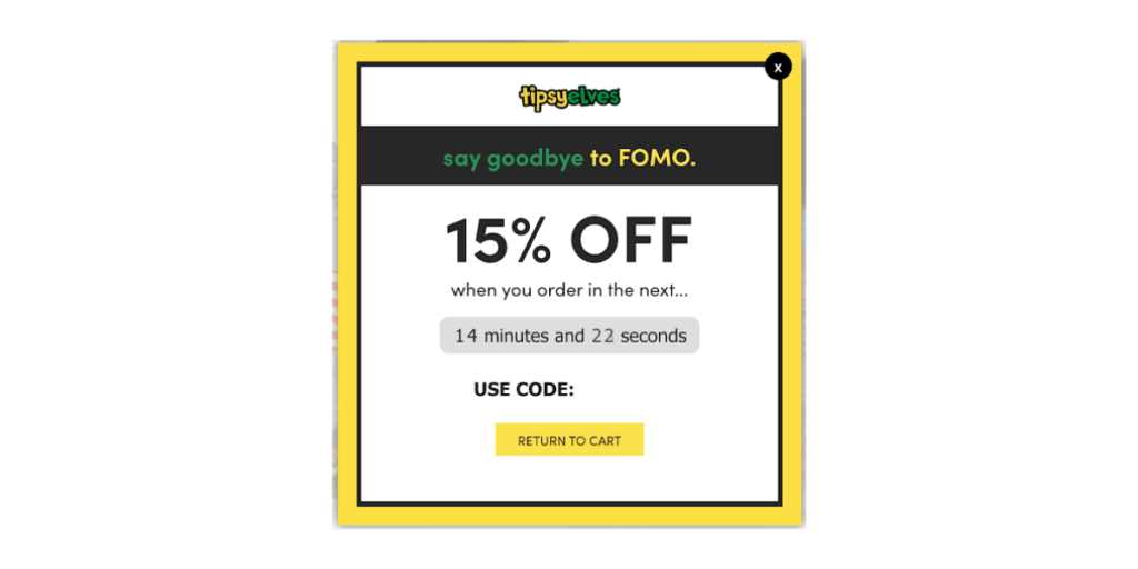
19. Timer + Other Incentives
Combine any of the suggested incentives above with a timer on your cart abandoner to increase the likelihood of a same-session conversion by putting them on a clock.
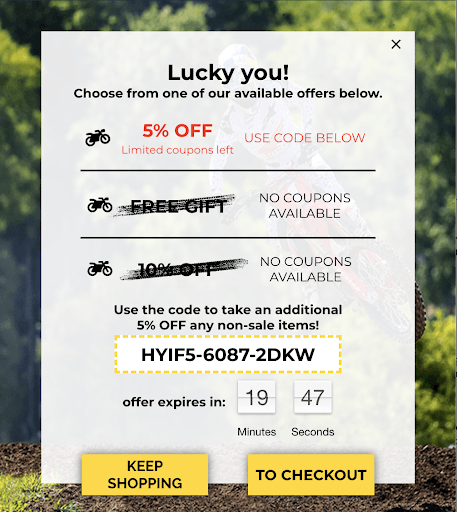
Justuno customer Stegmann used this as a part of their exit strategy, leveraging a discount + timer cart abandoner that led to 29.3% engagement, and over 80% of that engaged traffic went on to complete their purchase during their session.
We typically see this used in tandem with a discount, but if you want to take that a step further, you could do it by tiers. Tiered discounts are when you increase the discount amount as shoppers move through their journey, for example, 10% off welcome pop-up, 15% off standard exit offer, and 20% off for cart abandonment.
Justuno customer Cornbread Hemp used a tiered discount strategy like this + a timer on their cart abandonment pop-up, which led to an overall 28% reduction in cart abandonment.
20. Abandoned Cart Reminder
If, despite your best efforts, the shopper still abandoned their cart but ended up returning—show them a side promotion with the product(s) they left behind + a CTA taking them directly to check out. This personalization is perfect for driving immediate conversion action and is the ideal onsite follow-up to complement the automated email/SMS abandonment flows you have set up.
If you are an online store, cart abandonment is likely high on your list of worries, but here at Justuno, we’ve got you covered. Implementing a full exit strategy using these three pop-ups, you can reduce bounce rate and browse/cart abandonment with an optimized BOFU. Justuno’s advanced targeting rules help kick all of these strategies up a notch with nearly limitless scenarios to help you create the ultimate website experience.
Finally, it’s important to note that all of these should be A/B tested to find the right combination of design, copy, incentive, and targeting that works for your target audience. This will help you get to the root cause of their exit and abandonment once and for all.
Ready to see the Justuno difference? Get started now with a free 14-day trial, or book a demo now to get a 1:1 walk-through of the platform.